Creating Custom Data Visualizations in Cognos Analytics 11.1.4

Creating Custom Data Visualizations
This year's Data and AI Forum offered a ton of opportunities to learn about new features available in the latest 11.1.4 release, hear about customer success stories, help design new pages for the community website, and find out what the IBM team has in mind for future releases. It was packed with informative sessions! I'd highly recommend it for anyone wanting to get a taste of what can be done with IBM's data analytics products and where they are headed.
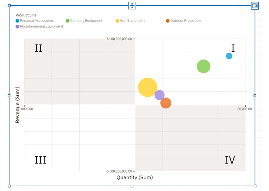
Today I want to focus on one of the new features that really stood out to me. Cognos now offers the ability to import custom visualizations including D3, Google Charts, and a number of other JavaScript based visualization engines. That means that if Cognos does not have a particular chart available, it can be added, including any number of properties to customize it as needed. Now, that's not to say it's easy to import, but with some JavaScript development skills, it is possible. Once it has been imported, the chart behaves just like native visualizations. When used in a Dashboard, you can click on a particular data item to have the other objects on the page filtered dynamically. You can drag it around and resize it as needed. To the end user, it looks just like any other visualization. After years of asking for charts with more customization and property options, we can finally add anything that's needed!
Details on how to create and import your own visualizations can be found in IBM's "Custom Visualization Developer Guide", but let's walk through it at a high level.
Step 1: Set up your development environment
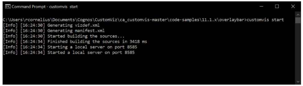
To be able to develop custom visualizations you're going to need a development environment. This is necessary so that you can make code changes locally, and quickly see the results in your Cognos environment. To do this, you'll need to install a JavaScript runtime called Node.js and download a file from your Cognos environment. Once this is set up, you'll be able to try out some of the example visualizations that are provided from IBM.
Step 2: Develop your visualization
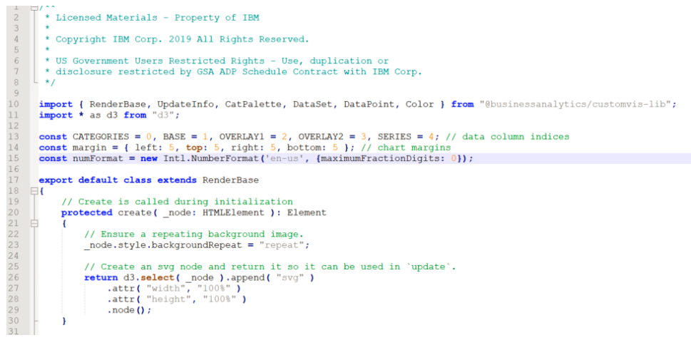
Once your environment is set, you can begin developing. It's usually easiest to start with one of the provided examples and tweak it to meet your needs. Most of the development happens using TypeScript, an open source language that's a superset of JavaScript. If you're already familiar with JavaScript, it should be pretty easy to pick up. There's a ton of information in the Developer Guide as well as other pages referenced by it.
I will note that depending on how comfortable you are with coding in general and D3 (or another visualization package), this could be a very steep learning curve. IBM will hopefully make an easier way to code visualizations at some point, but for now, you need to get pretty deep in the weeds with some JavaScript APIs.
Step 3: Test your visualization
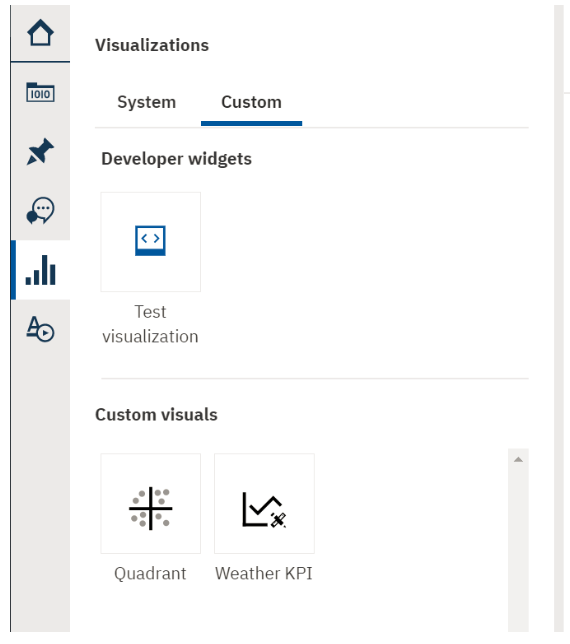
I'll add this as a separate step, but developing and testing really happens at the same time. You make a small change, test, make another change, test again, etc. until everything works how you'd like. IBM has done a good job of making this part pretty simple. The Dashboard authoring interface in Cognos now has a Custom visualization section. You can go there and drag "Test visualization" onto the canvas. Cognos will use your local Node.js instance for that visualization instead of looking on the server. There's no need to go through a full import process until your development is complete.
Step 4: Package and Import your visualization
Once your development is complete, you can package your visualization into a zip file using a command found in the Developer Guide and then import it into Cognos using the Manage UI panel. There's a new section under Customization for managing custom visuals. At that point, your creation will be available to Dashboard and Report Authors to use as needed. It will look and act just like any of the other out-of-the-box 11.1 visualizations.
Wrapping up
While creating your own custom visualizations is not an easy process (yet), with a bit of effort, it does open up a world of possibilities. When you consider D3, Google Charts, and the other popular charting libraries, there are thousands of examples of charts out there that can be adapted to be used within your Cognos environment. Best of all, once they are imported, they behave just like a native visualization.
Conclusion
If you have some development skills, I encourage you to check out the developer guide and play around with the provided examples. On the other hand, if you have a need for a particular chart that is not available in Cognos but the thought of looking at code makes your eyes glaze over, let us know. We would be happy to work with you to create a custom visualization to meet your needs.
Next Steps
We hope you found this article informative. Be sure to subscribe to our newsletter for data and analytics news, updates, and insights that are delivered directly to your inbox.
If you have any questions or would like PMsquare to provide guidance and support for your analytics solution, contact us today.
Learn More
For more insight into this topic, check out Rory’s BACon Presentation on YouTube, which expands on the insights covered here. See real-world examples, practical tips, and additional information to help you navigate custom visualizations more effectively.
