Build Better Dashboards With New KPI Viz
Build it Better
At the recent 2019 IBM Data & AI Forum in Miami, IBM Offering Managers did a great job walking through recent product enhancements and future focus. There are so many appealing, new tidbits! Not trying to cover them all here, so make sure to check out the Cognos Analytics 11.1.4 release notes for something more comprehensive. As always, for even deeper insight, make sure to check out my colleagues' blogs...CognosPaul, IBM Blueview, and Atlantic Cognos.
Upgraded 11.1.4 users will quickly notice a few new things upon login. The revamped Welcome screen (which users can toggle off) has a more modern look and user enablement is a bit more to the forefront (“Take a quick tour,” “How-to catalog,” “Samples,” etc.).
Additionally, there is a new alerts banner at the top of the home screen where admins can create customized messages to the user community (think maintenance, best practice reminders, news).
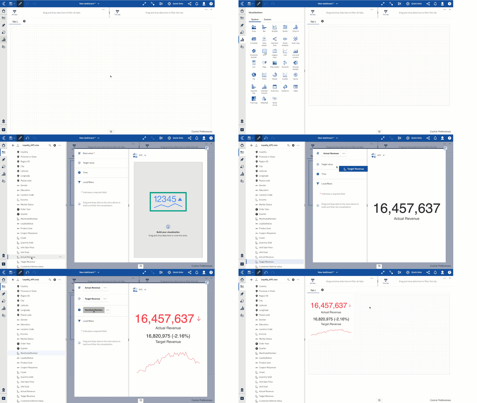
Among the many other new features, one that really stands out to me was the new KPI visualization. While a simple concept, this addition allows for much more effective dashboards and scorecards. As someone who has spent a lot of time working with corporate balanced scorecard initiatives in Cognos Metrics Manager, this new KPI visualization gets us closer to that same sort of comprehensive scorecard-esque, 'performance at a glance' means of metric presentation.
Developers can specify the actual, target, and time component (an optional field that can be used to generate a spark line). Targets themselves can be set from the data, a calculation, or a manual value in the properties. That alone is awesome! In many instances, for high-level metrics, the targets aren't captured in an analytic data source, unless you happen to have the luxury of utilizing Planning Analytics or similar. Red-yellow-green (or similar) bad-average-good performance scale is used (customizable, a bit with colors and ranges...can do 1-3 ranges). We can specify a shape to display as well (arrows up/down, thumbs up/down, etc.) when comparing to previous performance.
Conclusion
Consider what you could do with previous versions' Summary or Table visualizations and compare that to the new art of the possible with the KPI visualization. While only a small technological addition, the opportunities for much-improved dashboards and scorecards are apparent!
Next Steps
We hope you found this article informative. Be sure to subscribe to our newsletter for data and analytics news, updates, and insights that are delivered directly to your inbox.
If you have any questions or would like PMsquare to provide guidance and support for your analytics solution, contact us today.


