Cognos 11.1.3 Overview

Cognos 11.1.3 Overview
The quarterly(ish) IBM Cognos release schedule marches into Summer 2019 with a bundle of fresh analytics goodness for all you Cognoids out there. In this Cognos 11.1.3 overview I’ll focus on the headline features – mostly in the form of enhancements to the Explore and AI Assistant capabilities introduced in the 11.1.1 release. The full release notes can be found here.
The AI Assistant Levels Up
The AI Assistant gets a major upgrade in Cognos 11.1.3 via the introduction of a host of new NLQ capabilities. Previous versions restricted text references to column titles only with no ability to filter or aggregate via natural language. For example, ‘show sales by year’ would generate a simple column chart, while ‘show sales for 2017’ would result in a ‘huh?’ and ‘show average sales for country by year excluding 2015’ would catch your server farm on fire. No longer! Let’s take a look at a few possibilities using the American Time Use Survey data set that you’ve undoubtedly seen me demo over the years.
Natural Language Query Aggregation
The AI assistant can now handle aggregation, as you can see below. I typed ‘show average weekly earnings by age range and education level’ and Cognos was able to apply an average and generate the example visualization with zero additional input or modeling of any kind. Pretty cool – who let Watson in the building?

Ask and ye shall receive… aggregations!
Natural Language Query Filtering
You can also apply filters simply by typing. In the example below, ‘show top 10 average weekly earnings by education level and age range’ generates exactly what I asked for. If I like it, I can drag-and-drop into my dashboard canvas and combine it with other visualizations.

Finally, a machine that really gets me!
Let’s break down what Cognos did here:
Applied an average aggregation to weekly earnings
Returned results for average weekly earnings by the combination of age range and education level
Filtered the results to only include the top 10
Generated 11(!) visualization options based on the above (each dot under the column chart represents a different visualization)
All without manual modeling, filtering, calculating or visualizing on my part.
A Dashboard from the Machine
For those of us who need things to be really, truly simple Cognos 11.1.3 offers the an out-of-the-box AI driven personal dashboard assistant. Observe what happens when you simply type ‘create dashboard!’
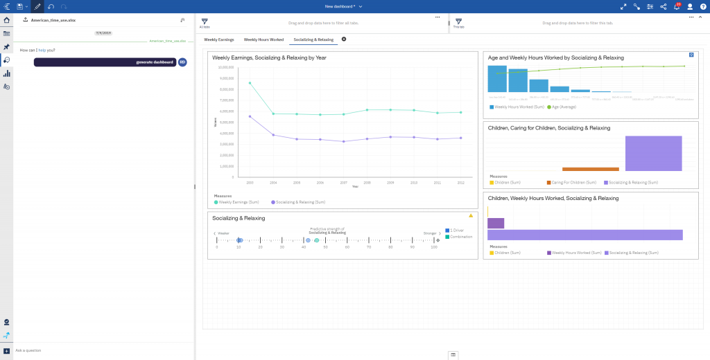
One phrase, a million possibilities…
That’s right, Cognos built an entire three tab dashboard automatically with a few keystrokes. The visualizations above are 100% interactive and customizable and include advanced types like a multi-factor predictive analysis.
Explore Enhancements
The Explore feature received a small bundle of improvements designed to make it easier to use. Many of my customers seem to view Explore as a feature for data scientists or extremely advanced analysts. This couldn’t be further from the truth – while it does provide access to some more ‘data sciency’ features, it’s ability to automatically suggest related visualizations and generate insightful English language descriptions of relationships in the data make it extremely useful for regular self service users. If you don’t believe me, gimme a call and we can work it out. I’ll jump off my soapbox now…
Relationships Automatically Uncovered
Explore makes it easy to see the relationships between fields in your data set regardless of whether you’re viewing an excel file or a SQl server data warehouse. In this release, you gain the ability to filter those relationships for strength to focus on only the most important ones as well as a redesign to make it easier to read. You can see below how I’ve chosen to focus on the primary relationships between Weekly Earnings and other fields in the data set while filtering out anything with a relationship strength below 10%. If I want to instead see those same parameters applied to Weekly Hours Worked or Television, I could simply click on them.
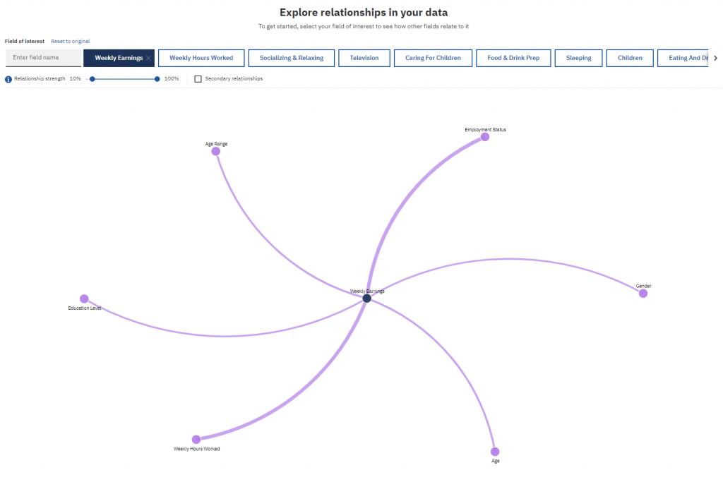
See how everything relates in your data
Interactive Visualization Comparisons
The ability to interactively compare visualizations has been in Cognos since 11.1.1 but was so well hidden that I often neglected to show it in demos as there was no great way to transition to it. They’ve surfaced it in the UI for this release and made it much easier to use. You can see below how I compare average weekly earnings by education for men vs women side by side, complete with English language descriptions of the data generated by Cognos.

Easy side by side visualization comparisons
Cognos 11.1.3 Overview Quick Hits
Those represent some of the more forward looking changes in Cognos 11.1.3, however there are some great bread-and-butter additions I’ll rapid fire for you now.
Reporting Updates
A few updates to reporting in this release – nothing major, but nice functionality nonetheless. First up, they redid the custom filter UI so that it’s easier to create explicit (individual) or conditional filters.

Next, they have added a report overview that gives you some nice information about what is contained in the report. It doesn’t offer a ton in the way of functionality at this point but it does let you clear param values from the report which is pretty useful.

The report overview page gets a makeover
Share via Email
One of the most requested features I see, Cognos can how share a report directly via email, complete with an annotated image of the report. Pretty cool!

Prettier Maps
Maps were updated to look better. And they do!

If you’re in Iceland and need Cognos expertise, please call me!
Drill-Through from 11.1 Visualizations
The 11.1 release brought new visualizations that have a host of awesome features, like browser-side rendering and more customization. They did not, however, include the ability to drill-through. Ya know, that little feature invented when I was in high school. That’s been fixed in 11.1.3.
Conclusion
That about wraps up the Cognos 11.1.3 overview. There are other improvements that I haven’t covered, most of which are nice quality of life enhancements. Some will be disappointed with the somewhat narrow scope of changes in this release, however I think things like the ability to share directly via email will be looked back on as a huge plus. While I don’t have any insider information (I swear…), I expect a larger release during or shortly after IBM Data and AI Forum in October. Be sure to subscribe to our newsletter for data and analytics news, updates, and insights delivered directly to your inbox.
Next Steps
If you have any questions or would like PMsquare to provide guidance and support for your analytics solution, contact us today.
Article contributed by Ryan Dolley via his blog: IBM BlueView
