Eric Dolley, July 2, 2019
Get the Best Solution for
Your Business Today!

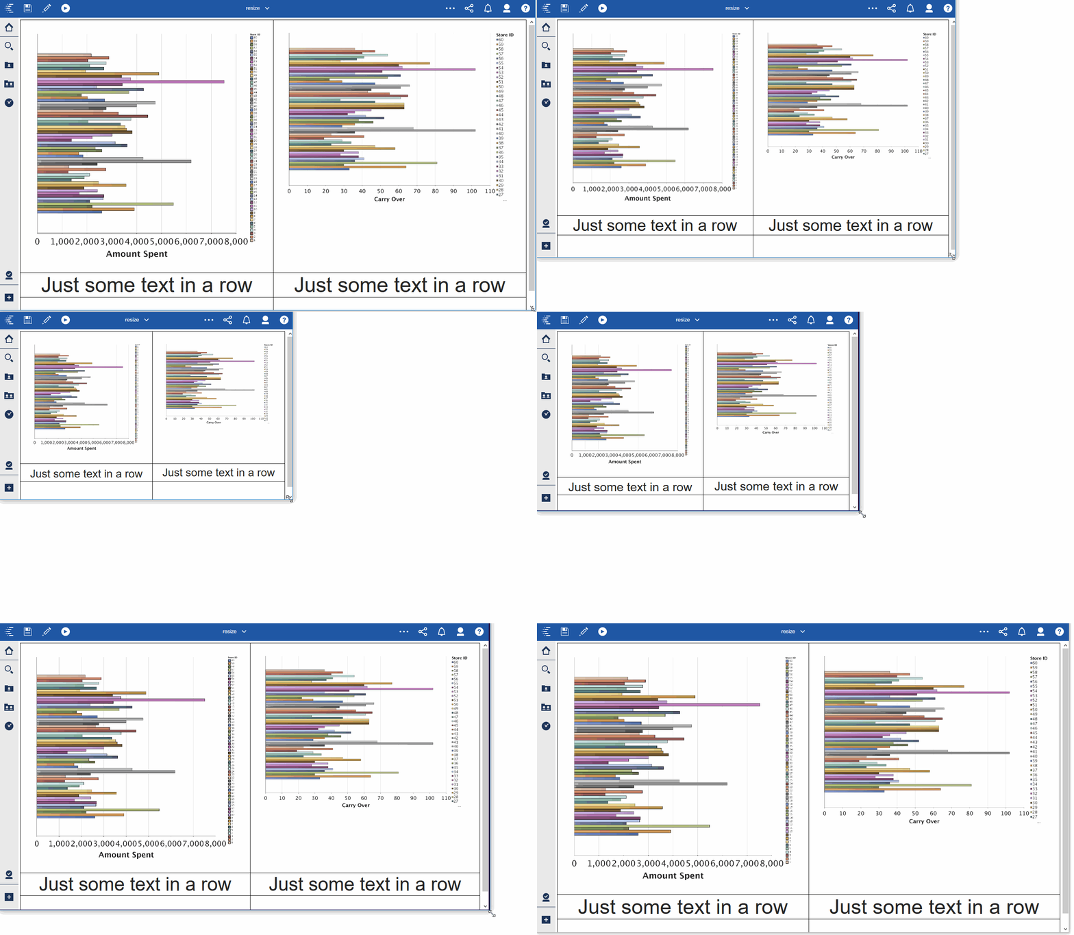
Have you ever wished you could make an old Cognos visualization look good on any screen? Or wished you could have a chart take up 100% of the space it has, dynamically resizing as the user resizes their window? Well here’s a simple to use custom control that can do exactly that!
For some background information, old-school Cognos visualizations are rendered on the server side as an image. That image is then provided to the report as is. This is why there isn’t an option to dynamically scale the chart to the page, and why you can’t set the dimensions of a chart to be a percentage.
Using the techniques outlined in this post, you will be able to have old-school charts automatically resize to fit the size of their parent container. The charts expand to match the width of their parent. They will maintain their aspect ratio, so a chart that is twice as wide as it is tall will stay that way.
There are two different methods for doing this. One for interactive mode reports, and one for non-interactive mode reports.
Non-interactive Mode Reports
If your report is a non-interactive mode report (most reports made prior to Cognos 11), you need to use the non-interactive JavaScript provided. Just put the JS into an html item at the bottom of your report.
Steps
1. Add an HTML item to the bottom of the page.
2. Paste in the following text:
“
<style>
[lid*="chart"]:not([lid*="chart4"]):not([lid*="chart3"]){
width: 100% !important;
height: auto !important;
}
</style>
<script src="https://cdnjs.cloudflare.com/ajax/libs/image-map-
resizer/1.0.9/js/imageMapResizer.min.js"></script>
<script>
imageMapResize();
</script>
“
3. If you wish to exclude a chart, add :not([lid*=”ChartNameHere”]) to the end of the css selector. See the code above for an example. You can add multiple :not([lid*=”ChartNameHere”]) to exclude multiple charts.
Sample Report:
DynamicChartsNonInteractive.txt
Interactive Mode Reports
If your report is interactive, there are a few more steps to follow. But the process is still very straightforward Follow the steps below.
Steps:
- Add a custom control to the page. Configure as follows:
UI type: UI without event propagation
Module Path: https://dl.dropboxusercontent.com/s/41lz2hk3pdjw4jh/resizechartall.js{ "exceptions": "ChartNameToExclude1,ChartNameToExclude2" } - To exclude any charts from resizing, include them in the configuration of the custom control.
- Add block to the report.
- Set an arbitrary height and width to the block. Suggested is 400px x 400px. Note: The width of the block will act as a “minimum size” for the chart.
- Choose the “content is clipped” option for the block.
- Add the chart to the block.
- The chart will now expand to fill the width of the parent container of the block.
Sample Report:
Custom Control Javascript:
Tips for using these techniques to make awesome looking charts and reports.
- If you want the charts to be higher resolution than they are by default in Cognos, set the dimensions of the chart to something higher than the parent container. The larger the dimensions of the chart, the higher the resolution of the chart image that the server provides.
- When making the charts oversized. Some of the elements such as labels will come out smaller than you expect. You can compensate for this by increasing the size of the labels in the chart properties.
- For the best results, place the charts (or the blocks containing the charts) into a table with width set to a percentage value. Use this table to subdivide your page into sections.
Conclusion
Using the above information, you should be able to take add dynamic resizing to any chart in Cognos. We hope you found this article informative. Be sure to subscribe to our newsletter for data and analytics news, updates, and insights delivered directly to your inbox.


