Rory Cornelius, March 3, 2020
Get the Best Solution for
Your Business Today!
Creating Custom Data Visualizations
The ability to add your own custom visualizations came with Cognos 11.1.4 and has only improved in the 11.1.5 release. Being able to create or adapt an existing chart created with any JavaScript library means we’re no longer tied to what IBM provides. If you see a chart in another tool that you like, then I’m sure there’s a way to create it in Cognos. It might take some coding, but it can be created. It will even look and behave like a native chart. It can have as many properties and configurations as you want to take the time to add. Let’s go through an example creating a calendar heat map chart from Google.
I would suggest you start by reviewing my overview blog post and then the Developer Guide provided by IBM. The guide takes you through an example step by step with quite a bit of detailed information. The example uses a simple D3 chart, which works great for getting started, but it takes quite a bit of D3 knowledge to build anything more complex. It has a ton of flexibility but also a pretty difficult learning curve. Cognos allows you to use any JavaScript based chart library, so I started looking around for something a little simpler and came across Google Charts. They don’t offer near the flexibility of D3, but there are quite a few options that have a variety of configuration properties that can be used, and they are significantly easier to incorporate.
Table of Contents
Check out the Google Charts web page to read more about the library in general. In this post, we’re going to look at the Calendar chart specifically.
How to Add a Google Calendar Chart
Step 1: Set Up Your Development Environment
To start, set up your development environment if you haven’t already. You’ll need to download Node.js and load a file that you can get from your Cognos environment install. Check out Chapter 2 in the Developer Guide for steps on how to do that.
Step 2: Create New Project Directory
Once your environment is set, open a command line interface and navigate to your development directory for custom visualizations.
Type: customvis create <chart name>
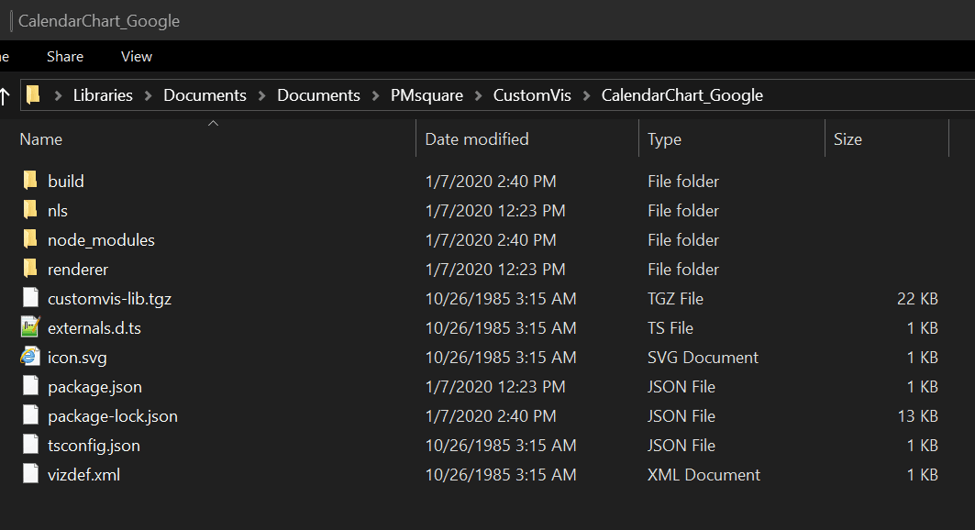
In this case, I called it CalendarChart_Google. This will create the directory and the base starting files.

Once it’s created, “cd” into the newly created directory and use “customvis start” to start the local server for the new custom visualization.

If all goes well, it should say “Started a local server on port 8585” at the bottom. You can create a new Dashboard in Cognos, select the visualizations pane, and then the Custom tab. Drag in the Test Visualization, and you’ll be able to see that it’s actually working. There isn’t much there at this point, but it should say “Basic VizBundle”.
Here is what your new project directory looks like:
Step 3: Declare Variable Named Google
In order to use Google Charts, the first file we need to update is externals.d.ts. It needs a single line added to declare the variable named google. Open the file in your favorite text editor and add line 2 below. It should look like this:

Step 4: Declare Slots to Define Type of Fields
Next, open the vizdef.xml file in your text editor. This is where we declare the slots which define the type of fields that our visualization will accept. The calendar chart example needs two slots. One is for the date, and the other is for the value.

Slots require a name attribute (for internal reference) and a type attribute (categorical or continuous). A categorical slot is for dimensions or attributes while a continuous slot holds the measures. In this case, we also have a caption attribute that is used for display. If no caption is specified, it uses the name field instead. The optional attribute is pretty self-explanatory. It is set to true by default, and here we need both a date and a value to display anything meaningful.
Step 5: Specify the DataSets
After declaring the slots, we need to specify the DataSets. These aren’t the typical Cognos DataSets that you may familiar with. This is just a definition that allows a slot to accept data. Currently, only one DataSet is allowed. Each slot should also be defined in this section. The full vizdef.xml should look like this:

Step 6: Check Your Work
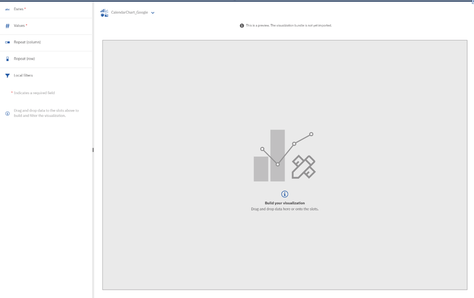
You can save the file at that point. If you open your command line window again, it should say “Generating vizdef.xml”. To make sure it’s all working correctly, start a new Dashboard in Cognos. Then go to the Visualizations pane and the Custom Visualization tab. Drag the Test Visualization onto the canvas. It should pop up with the two slots that were defined available for populating.
Step 7: Import JavaScript Library & Type of Chart
We’ll add more to the vizdef.xml later to expose some extra properties, but that’s enough to get us started. The next file we need to edit is in the “renderer” folder. Open Main.ts in your text editor. This is where the real coding happens!
Here’s where we need to look at the code for the Google chart and figure out how we need to incorporate that into our Main.ts file. The first thing is to import the JavaScript library to be used within the visualization code. After importing the library, we need to use it to load the type of chart we want. In this case, that’s the “calendar” chart.
The first few lines should look like this:

Line 1: Provided as part of the initial file
Line 2: Import the Google JavaScript library
Line 4: Load the Calendar chart package
Step 8: Use Update Method
The initially provided code has a simple class definition that extends the RenderBase class. There is a CustomVis API page that provides more details. It implements the “create” method by default. This is called only once when the visualization is initially created on the canvas. From that point on, if the data is changed or the properties change or even the size of the chart changes, it’s the “update” method that gets called. In this case, we don’t really have any initialization code that’s needed, so we can remove the create method altogether and just use the update method.

For this example, almost all of our code will go within this function.
Now let’s go back to the Google Calendar Chart page and look at the example code provided under “A Simple Example.” Specifically, let’s look at the drawChart method. The first thing it does is create a DataTable and add data to it. In the example it’s hardcoded data, but we want to be able to provide data from Cognos using the slots that were added to the vizdef.xml file. Where do we get to that data? Check out the UpdateInfo object that gets passed as a parameter to the update method. One of its properties is a DataSet. (Again, keep in mind that this has no real relation to the Cognos DataSet. This is a JavaScript object that holds whatever type of data is being passed in from Cognos.)
Step 9: Add a Constant and If-statement
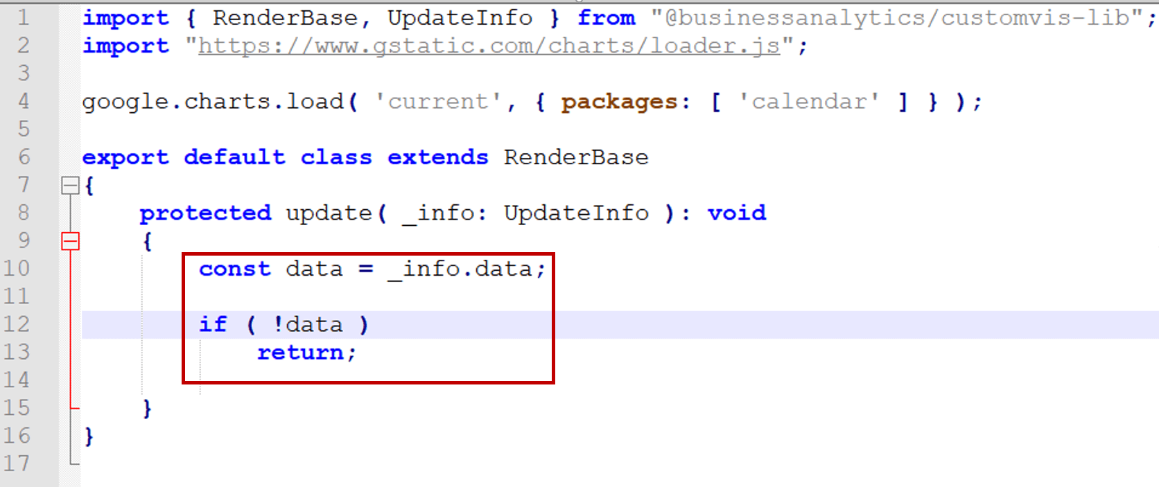
We’ll add a constant to hold our data that comes from the UpdateInfo parameter (_info). We can also add an if-statement in case there’s no data. That will prevent unnecessary errors from getting shown to the end user before data is provided.
This would be a good place to save the Main.ts file. If you jump back to your command line, it should look something like this if everything compiles successfully:

You can ignore the warning about the Google library being treated as an external dependency. As long as the “Finished building the sources” part is there, you should be good. Any code errors will be called out here, however.
Step 10: Convert DataSet
Unfortunately, Google charts don’t take the format of the DataSet that is provided from Cognos, so we need to convert it to a Google DataTable. The first thing to do is to create a new object for the DataTable. Then we can populate it. Here is the updated code to do that along with extra comments:
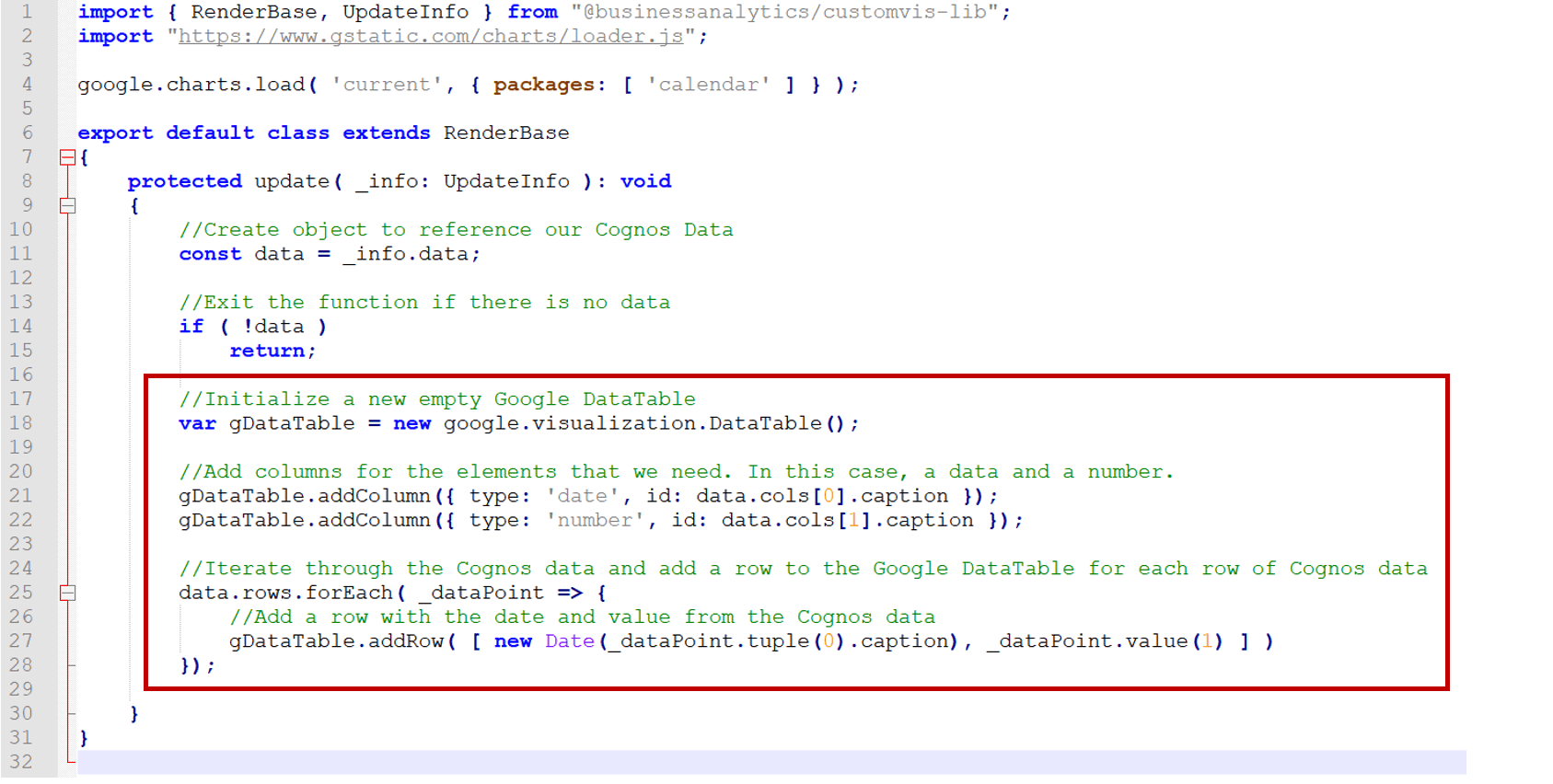
Line 18 above initializes the DataTable. Lines 21 and 22 add our two columns for the date and the value. The first attribute is the data type and the second is a unique identifier that we get from the Cognos data item that is mapped to the slot. Once the columns are created, we can iterate through our DataSet and populate the Google DataTable (Lines 25-28). Each row from our DataSet contains a DataPoint. Each DataPoint has several properties to be able to access the data you need. For categorical slots (dimensions or attributes), you use the tuple property to get to the information. On Line 27, “_dataPoint.tuple(0).caption” gets the date value. It’s then wrapped in a JavaScript Date object so that it can be used by the Calendar chart as a date. The 0 passed to the tuple function indicates it’s the first column within the DataPoint based on how we defined the slots. The Date slot came first, so it is the first column. “_dataPoint.value(1)” gets the continuous slot (measures) value. The 1 passed to the value function indicates the second column within the DataPoint. We now have a populated Google DataTable to use for creating our chart.
This is another good place to save your work and make sure the code compiles. You can even try adding the Test Visualization in Cognos. It still won’t show anything since we aren’t creating the chart yet, but you can drag in some data items.
Step 11: Create Chart
The next step is to actually create the chart.
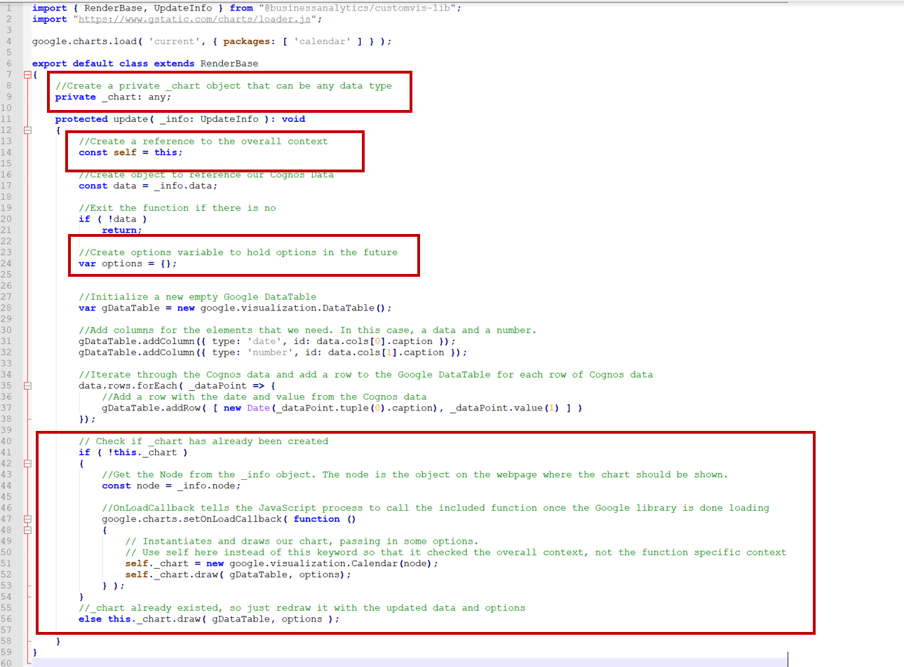
We needed a couple of extra variables for this chunk of code. On line 9, a _chart object is defined. This will let us keep track of our chart across multiple update calls. Line 14 create a constant called self. This is just a way to reference the overall context from within a function later on. Line 24 creates an empty object for our properties. In the next step we’ll look at adding extra properties. For now, we just need an empty object to be able to pass to our chart’s draw method.
The main portion of this code starts at line 41. First, we check if the _chart object has been created or not. If not, create it. Line 44 creates a reference to the node object. In this case the node is the HTML object that holds the Cognos visualization. Basically, this tells the JavaScript where to put the chart on the page. Line 47 creates a callback function. This function gets called once the Google Chart library is done loading. This happens asynchronously, so the callback function makes sure it doesn’t try creating the chart until the library is available. Line 51 creates the Calendar chart object that references the node. Line 52 draws the chart using the Google DataTable we created and our empty options object. Finally, line 56 is the “else” to our “if” statement from above. It just calls the draw method if the chart already exists.
Here we can save the file and actually see something in Cognos. To see something interesting, you’ll need data that contains a date field and an associated measure. In my example, I’m going to use an uploaded file that has the attendance of every Major League Baseball game in 2019. Here’s what it creates:
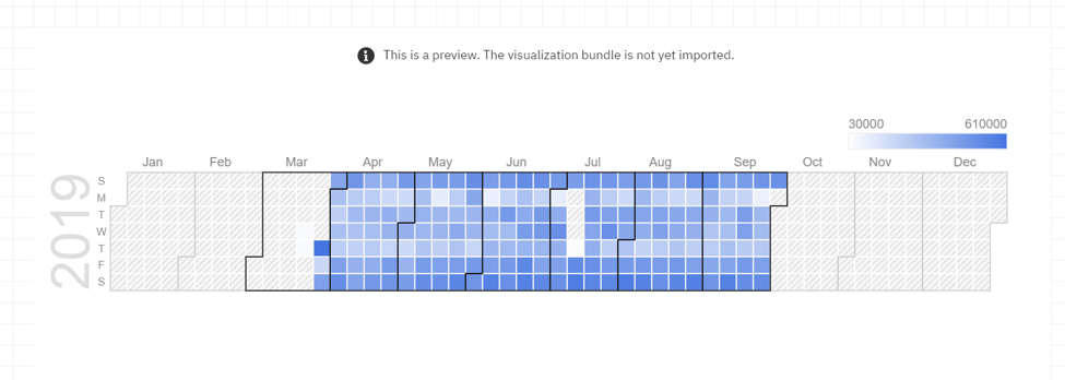
In this example, I’m only looking at one year. If you have multiple years in your data set, you’ll see multiple calendars. Based on the color, we can see that total attendance across MLB games ranged from about 30,000 to 610,000 for a particular day. We can also see that weekends have the highest attendance, as expected. Mondays and Thursdays, except for opening day, have the lowest. This chart makes it easy to see the trend across the days of the week and even across the season.
Step 11: Add Cell Size & Chart Title (vizdef.xml)
Now that we have a chart created, let’s take a look at the different properties that can be set. The best place to find the options for the chart is back on the Google Calendar Chart page. The first example there adds a title to the chart and changes the cell size. We could hardcode that into the Main.ts file, but to make this as configurable as possible, we can expose these properties so they can be set within Cognos. To do that, we first need to add them to the vizdef.xml file.

Lines 15 through 20 have the new code for these properties. Line 16 defines the group which is where these will be displayed in the Properties pane in Cognos. You can create multiple groups here, but from what I’ve seen, it doesn’t really matter. Cognos will display them wherever it wants.
Line 17 is a “string” type. The name attribute is required, but I also included a caption and a defaultValue. The caption is what is displayed on the Properties pane in Cognos. Line 18 is a “number” type. It has some validation included to make sure the value is at least 5. Anything smaller than that and the calendar is unreadable.
Step 12: Add Cell Size & Chart Title (Main.ts)
Save the vizdef.xml file. You can go refresh the chart in Cognos at this point and see these properties show up in the Properties pane, but they’re not actually connected to anything. Open the Main.ts file again and let’s add them there.
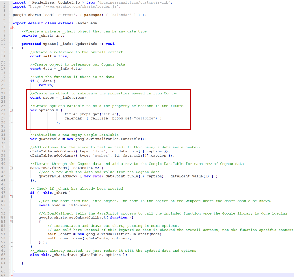
The changes here start at Line 23. First, a “props” variable is created to reference the properties from the UpdateInfo parameter. That is how we get access to the properties added in the vizdef.xml file and that are updated on the Cognos Properties pane. The options, starting on Line 27, follow the format needed for the Calendar Chart. To get the values, use “props.get(propertyName)”. We’re already passing the “options” object to the chart’s draw method, so that’s all the updates needed. You can save the Main.ts file and check out the updated chart in Cognos.
NOTE: You may have to close the Dashboard, refresh the page, and create a new Dashboard to get the new properties to display. They don’t always seem to load on just a chart refresh.
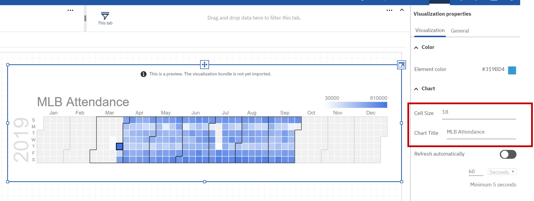
Here’s the chart with the associated properties on the right. I’ve updated the default to a Cell Size of 18 and set the title to “MLB Attendance”. The chart gets redrawn any time a property is changed.
Note the Element Color property. That is on the Properties Pane by default, and unfortunately, it’s not connected to anything. You can change it, but it doesn’t update anything on the chart.
Step 13: Add Data Formatting
Since that property doesn’t work, how would we go about changing the color of the cells? Let’s go back to the Google Calendar Chart page and look at the Data Format section. There you’ll find the colorAxis and colorAxis.colors properties. These can be used to set the colors in the gradient for the values.
First, the properties need to be added to the vizdef.xml file.
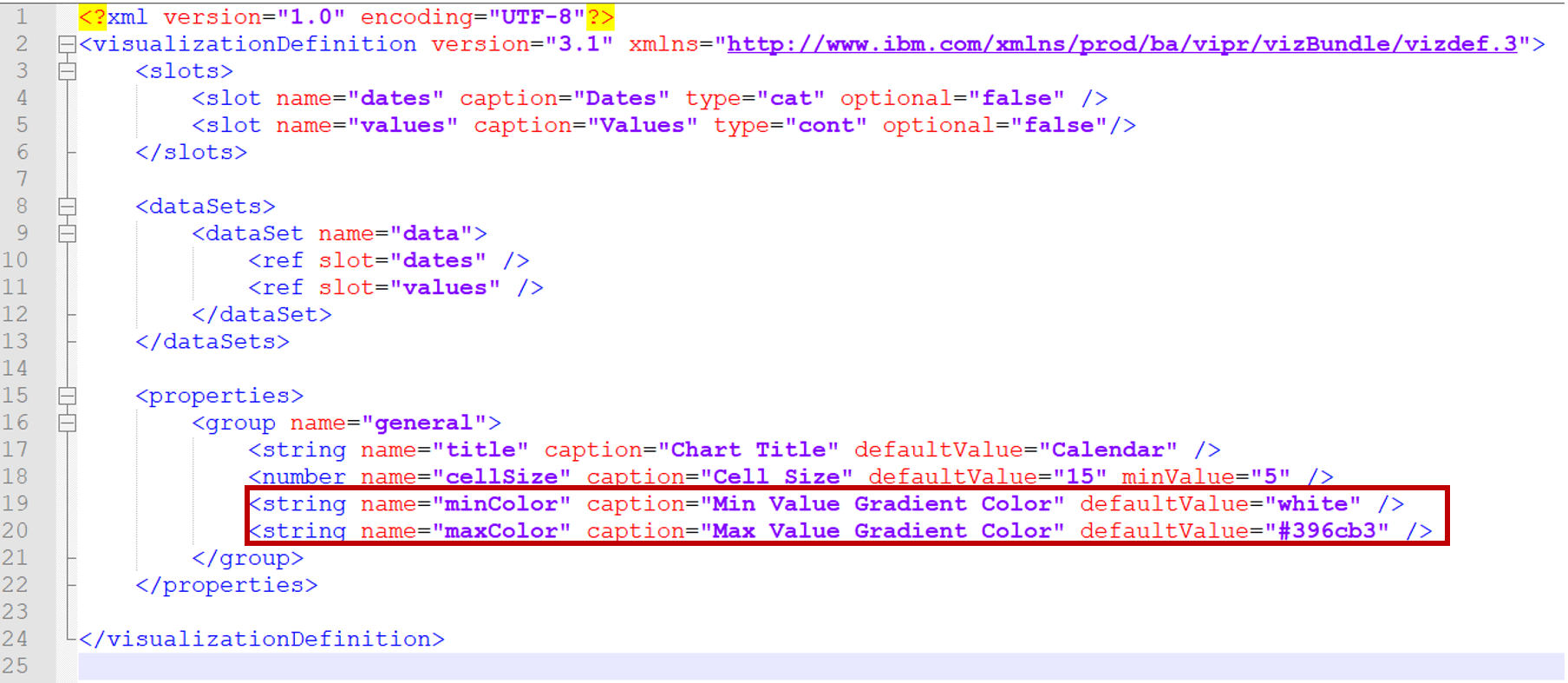
Lines 19 and 20 have the definitions for our minimum and maximum gradient colors. In this case, I used a string property. The vizdef API does have a Color option, but it’s not currently working correctly with Cognos for this chart. Using the string property just means that we’ll have to type in the color name or hex color code instead of using a color picker UI element. I provided a couple of default values to show how both of those options would be entered. After adding these lines, save the vizdef.xml file and we can move on the Main.ts file updates.

The minColor and maxColor properties are added to Line 30 above in the “options” variable. Save the Main.ts file, and refresh the Dashboard to get the updates.
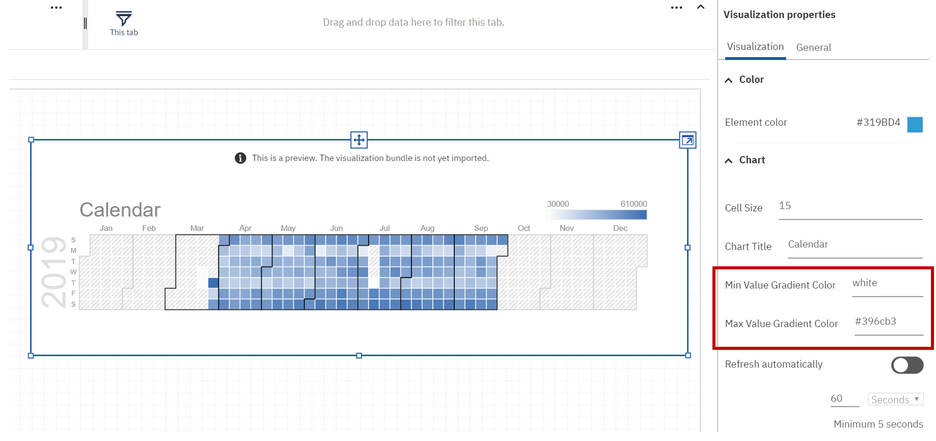
The new properties are available on the Properties pane. You can either type in a color name or a hex value.

Here’s the same chart, but it has “red” for the minimum gradient value instead of white. I think this actually makes it a little easier to see the difference between the low and high values. I also updated the Chart Title to “MLB Attendance” to reflect the data that being displayed.
There are a few more properties available that could be exposed, but I’ll leave that as an exercise for you to attempt on your own. Feel free to reach out if you run into any issues though.
Step 14: Package Chart as a Custom Visualization
At this point, let’s package this chart as a custom visualization so that other dashboard and report authors can use it. We’ll need to go back to our command line interface. You can use CTRL-C to kill the running process, and answer Y for terminating the batch job. You should still be within the CalendarChart_Google directory. Run the command “customvis pack.” It should look like this:

Step 15: Deploy Custom Visualization
If you have access to the Manage panel in Cognos, as well as the Customization tab, then you should be able to deploy this yourself. Open the Customization panel and select the Custom Visuals tab. Click the “Upload custom visual” button at the top, and select the zip file created in the step above. After uploading, it should look like this:

If you don’t have access to this location, send the zip file to a Cognos administrator for them to deploy.
Now when I create a new Dashboard and go to the Custom Visuals tab, instead of using the Test visualization, my Calendar Chart is available to select.

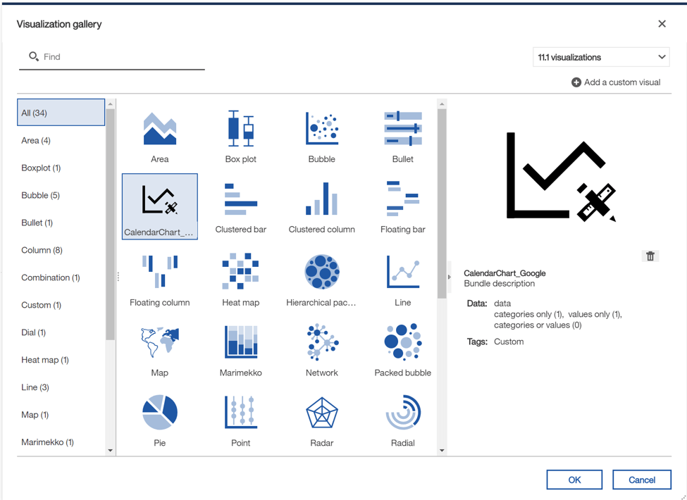
In Reporting, the custom visualization shows up in the list with all of the other 11.1 visualizations:
Check out the attached zip file for the final code, the data file that I used, and the packed deployment archive that you can feel free to use in your environment.
Conclusion
Hopefully this gives you a taste of what can be done with custom visualizations in Cognos. There are tons of other possibilities using both Google Charts and other JavaScript charting libraries such as D3, Highcharts, or FusionCharts. Each library comes with its own unique set of challenges and capabilities. Check them out and give it a try. If you come across a chart that you really wish you had in Cognos but don’t have the skills or desire to implement it, let us know. We’d be happy to see what we can do to help out!
Next Steps
We hope you found this article informative. Be sure to subscribe to our newsletter for data and analytics news, updates, and insights delivered directly to your inbox.
If you have any questions or would like PMsquare to provide guidance and support for your analytics solution, contact us today.
