Anusha Bajracharya, December 16, 2024
Get the Best Solution for
Your Business Today!
Have you ever encountered issues with systems slowing down when too many tasks are scheduled at once? It’s typical to observe this behavior in servers and can quickly become a recurring problem when multiple users schedule multiple reports at the same time. This leads to slower performance, delayed reports, and even system crashes. The challenge was clear: users needed a way to visualize report scheduling and adjust their schedule to prevent system overload. Leveraging CogBox, a suite of tools designed for developers to enhance and automate content creation in Cognos Analytics, we developed a visual solution for this problem to help users manage report scheduling efficiently.
Note: This blog offers a sneak peek into exciting upcoming features of CogBox, specifically the enhanced report scheduling functionality. Please note that these capabilities are not yet available in the current version of CogBox, but they are actively in development and coming soon.
Table of Contents
A Proactive Approach
The solution developed within CogBox is a straightforward design to prevent scheduling conflicts. It will notify users when they attempt to schedule a report during a time period already occupied by other content. This empowers users to make informed decisions and avoid contributing to high system load. To enable this behavior, a Gantt chart solution was implemented to provide a clear visual representation of existing schedules. The chart highlights potential server overloads in red, helping users to proactively manage and adjust overlapping schedules to maintain optimal system performance.
A Visual Solution
From a UI/UX perspective, solving the report scheduling conflict in Cogbox was a challenging, yet insightful task. Based on our analysis, up to 10,000 reports could be scheduled simultaneously. To simplify the UI for larger deployments, we targeted 200 schedules to be considered as high system load that would be represented in the Gantt chart design. The path to the end product wasn’t a neat, linear line. Below were our different UI/UX design interations that were experimented with on the road to the final implementation.
Iteration 1: Visualizing Every Minute
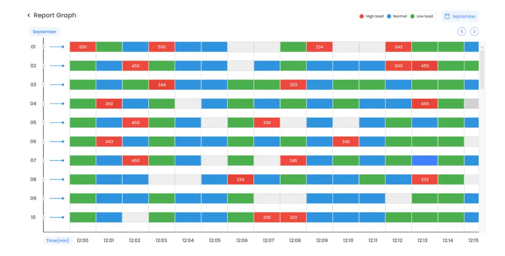
Initially, a Gantt chart was used to display report scheduling data, with the X-axis showing each minute and the Y-axis each day. Colors indicated load levels—red for high, green for low, and blue for medium—and detailed the number of reports for high-load periods. This design aimed to help users identify and manage high scheduling activity to prevent server overload, with a monthly filter for additional clarity.
However, showing data for every minute of a 24-hour day made the chart overly complex. Users found the volume of data overwhelming, which hindered their ability to draw meaningful insights.
Iteration 2: Shifting to Hourly Scheduling
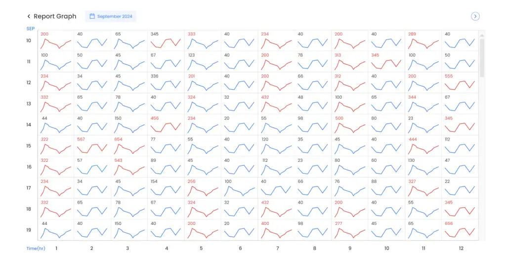
In the second iteration, the Gantt chart was simplified by shifting the focus to hourly report scheduling. Instead of displaying each minute, we used a line chart to show the number of reports scheduled per hour. A 12-hour report scheduling view is initially displayed, with the option to switch to the next 12-hour view using the button at the top. A red line was used to highlight periods of high system load, while a blue line represented low to medium load. This approach allowed users to easily identify critical periods of potential overload, offering a clearer, more manageable view of scheduling patterns.
Iteration 3: Enhanced Data Insights with Detailed Views and Information
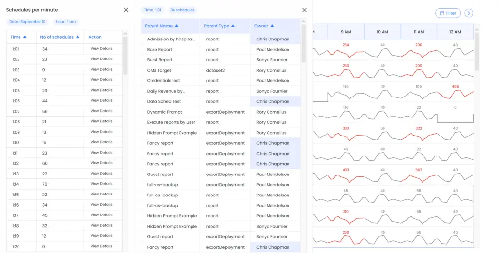
In the third iteration, users still struggled with the broad 24-hour view when trying to focus on specific hourly data. To address this, a calendar filter was added that lets users select the month and day, simplifying the view to specific timeframes. This enhancement made it easier to analyze detailed scheduling data for selected hours.
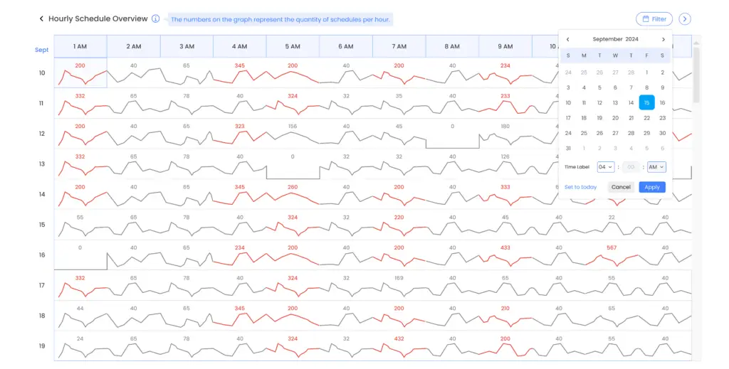
Furthermore, clicking on an hour within the chart now reveals a side menu with a table showing the time and number of scheduled reports. The ‘View Details’ option opens another menu with specifics such as the parent’s name, parent type, and the owner of the most reports, highlighted for clarity. High-load hours are marked with a red line, while other times are greyed out. An information button provides explanations of the data, aiding users in making more informed scheduling decisions.
Wrap-up
The iterative improvements to the Gantt chart transformed the approach of managing report scheduling. By shifting from a complex minute-by-minute view to a more intuitive hourly perspective with a calendar filter, and incorporating detailed insights through dynamic side menus, users now have a clearer and more manageable way to identify and resolve scheduling conflicts. This refined process not only prevents server overload but also enhances overall efficiency, ensuring a more balanced and responsive system.
Next Steps
Please note that the report scheduling functionality is not yet available in the current version of CogBox. Make sure to watch for updates to know when our next CogBox release is and how these exciting new features can help optimize your scheduling processes.
If you have any questions or would like PMsquare to provide guidance and support for report scheduling or your Cognos Analytics implementation, contact us today. Follow the link to learn more about CogBox and how you leverage these developer tools to enhance and automate content creation.
Be sure to subscribe to our newsletter to have PMsquare articles and updates sent straight to your inbox.
Published Date:
