

Share


Dan Swan, February 12, 2024
Get the Best Solution for
Your Business Today!
In this article we will go over the basics of creating a Listing Table visualization with Incorta Analyzer.
Incorta Analyzer is the tool for creating and editing Incorta Insights. An “Insight” is how Incorta refers to a visualization, which may include Excel-like tabular report listings, aggregated reports as well as charts or graphs. Regardless of the forms, the goal is to give users insights into their company’s data.
If you are not familiar with Incorta, watch the two videos from Incorta linked below to get a good overview of the application.
You can also watch our video series on YouTube that goes hand-in-hand with these articles:
Table of Contents
Organizing Within Incorta
Incorta states that a visualization “consists of configurable properties and related behaviors for displaying data in a specific form such as a single value, a table of columns and rows, a chart, a graph, a map, or a gauge.” A visualization in Incorta can also be defined as a component of Incorta Analyzer that can display tabular data in three different formats, or it can display data using one of 46 different types of charts and graphs.
The Incorta application and documentation (including this document) may also refer to a visualization as an “insight”. An Insight is a visualization that is utilized in a Dashboard. You will see the term “Insight” used often in the application as shown below.
An Insight is created inside an Incorta Dashboard within the Content section in Incorta. Within the Content section you can also create a folder to house your Dashboard. We recommend that you use folders to organize your Dashboards, which can help you and your users find visualizations quickly.
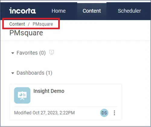
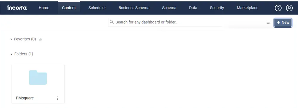
Below is an example of how Incorta can be organized. Under Content, we have one folder called “PMsquare” and within the PMsquare folder we have one Dashboard called “Insight Demo”. You can have several folders under Content, and we can have multiple Dashboards in each folder. You also can have folders within folders.
Note: The folder/Dashboard path is shown in the upper-left part of the Content screen. Below you can see the path from within the PMsquare folder.
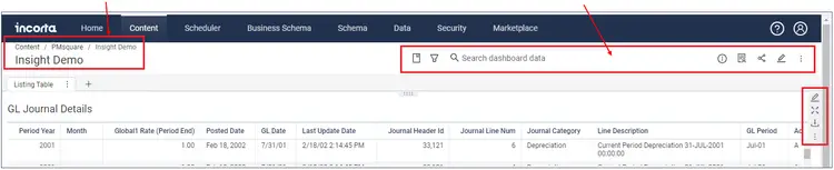
In the image below, you can see the Dashboard name and path, as well as the Action Bar.
Visualization/Insight Basics
A Listing Table is one of three types of tabular visualizations used in Incorta. Use tabular visualizations to list and/or compare specific metrics for reporting or analysis.
Visualizations that display data in a tabular format are:
- Listing Table
- Aggregated Table
- Pivot Table
A Listing Table displays the lowest level of data within your table, or tables. As the name implies, a listing table simply lists data from a table or tables, with the ability to summarize and group data based on parameters you select. A Listing table is best suited for viewing detailed data in your tables while still giving you the ability to create sub-totals and totals.
An Aggregated Table can also display tabular data, but it summarizes based on the grouping choices. You can also filter on the aggregated values. You can aggregate based on sum, average, min, max, etc. There are other advanced properties that we will cover in another post.
A Pivot Table shares the features of the Listing and Aggregated tables, and includes the ability to control what appears in the rows and columns in place of a grouping dimension. We will also cover basic and advanced Pivot Table properties in a later post.
Shown below is the Insight Panel for a Listing Table visualization.
Grouping Dimension, Measure, Individual Filter, Distinct Filter and Sort By are the “Trays” available for a Listing Table Insight.
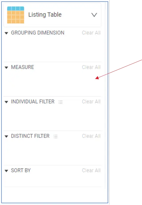
A table column or formula you place into a Tray is called a Pill. Each Pill is configurable with specific properties depending on which Tray it’s in.
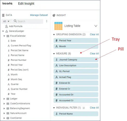
These Trays will be populated with columns from one or more tables (or views) and formulas that you create specifically for your insight.
Tray Types for a Listing Table
The Grouping Dimension is used to group your data, which could be by account, organization, time, etc. The groupings can be accomplished using a table column or formula. Each grouping can be used as a filter within the Insight.
Click on a Pill to highlight, then click the arrow to view and/or change the available Properties.
Measure is typically used to display measurable numeric data like account balances or number of products sold. A Measure appears as a column in a Listing table. In a Listing table, the Measure tray can contain all types of data, not just numeric data. You can drag and drop an entire table into the Measure tray to display the contents of that table. Incorta recommends you use a Listing Table this way. We will demonstrate this feature later in this post.
The Individual Filter is used to filter data at the lowest level of your table or view.
Sort By lets you sort the report on a specific set of one or more columns from the Data Panel. You cannot use formulas to sort by.
Components of the Analyzer
Before we build an Insight, let’s review the Analyzer’s basic features.
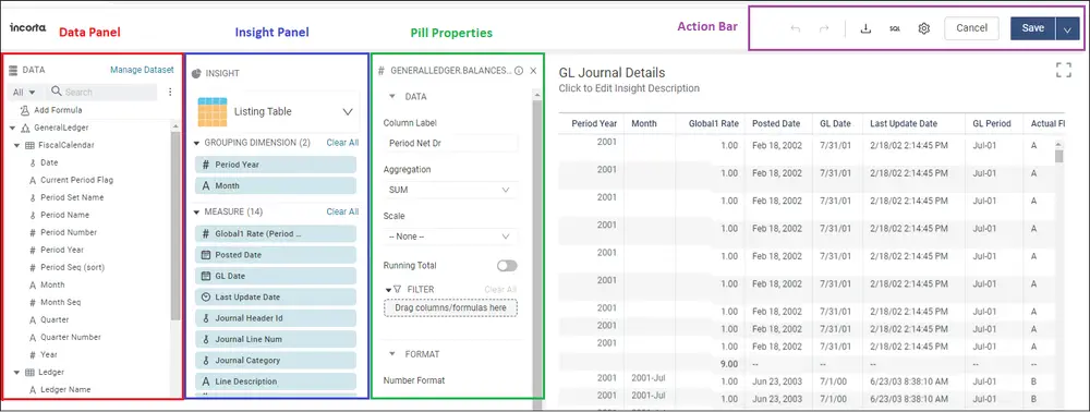
- The Data Panel contains the tables/views you can use in your Insight.
- The Insight Panel houses the Trays and Pills used in your Insight.
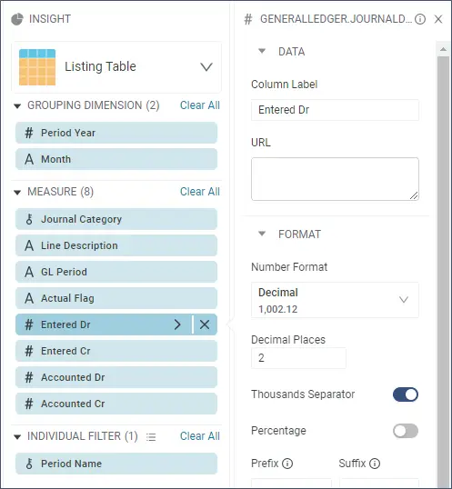
- Pill Properties will appear when you select a Pill, then click the arrow on the right side of the pill.
- Go to the Action Bar to change settings, download the Insight, view the SQL, or save the Insight.
Building a Listing Table Insight
If this is the first Insight, you may want to begin by creating a folder to hold your new Dashboard and Insight. However, you must at least create a Dashboard to contain your Insight.
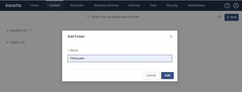
To create a folder, log on to Incorta, go to Content and click on the New button then select Add Folder.
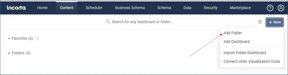
With the Add Folder window open, type in the name of your new folder and click Add.
Your new folder will appear in Content.
Click on your new folder to open it.
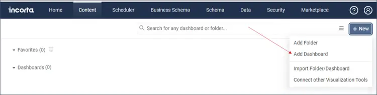
Now add a Dashboard in your new folder. Click on the New button and select Add Dashboard.
In the Add Dashboard window, enter the name of your new Dashboard. Add a description if needed.
The new Dashboard, named “Insight Demo” has been added. Click on the Dashboard to open it.

Using Incorta Analyzer
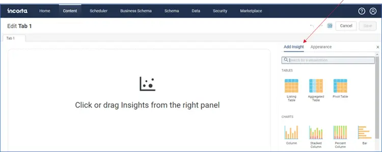
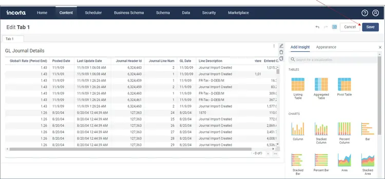
By default, your new Dashboard will contain a single tab (“Tab 1”). Click on the Add Insight button.
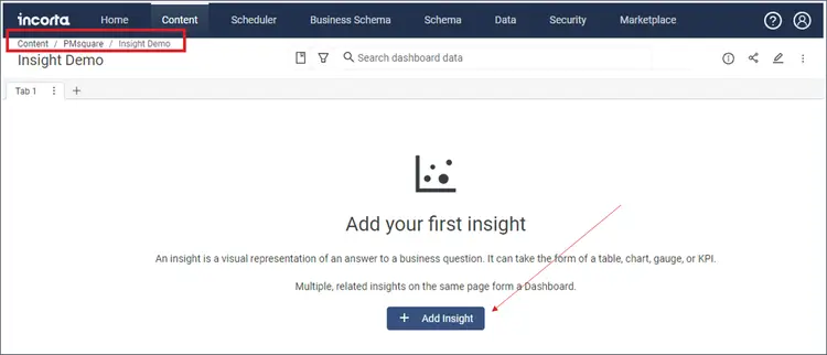
Note the path to your Dashboard and Insight are shown at the top of the screen. You can navigate back to a folder or back to Content by clicking on desired part of the path.
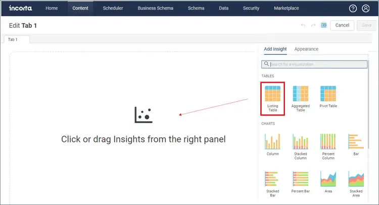
Choose the Listing Table visualization by clicking or dragging it to the canvas to start your Insight.
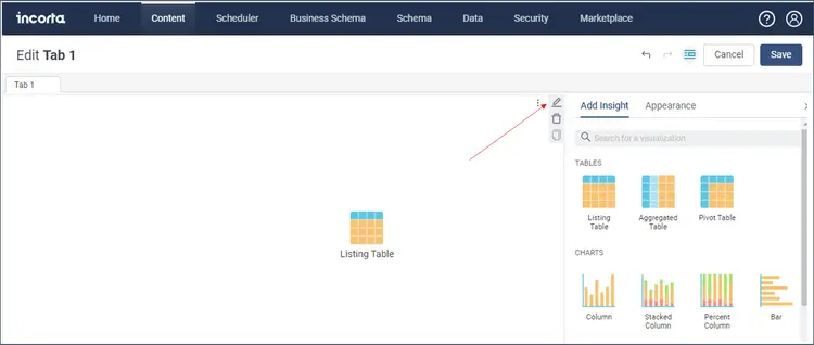
Click on the Listing Table and then click on the Pen icon to open and edit the Insight.
In Edit mode, you can see the Trays you have available for a Listing Table.
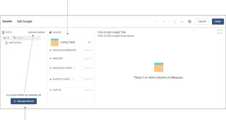
Click on Manage Dataset, either at the top or bottom to view the available data sources.
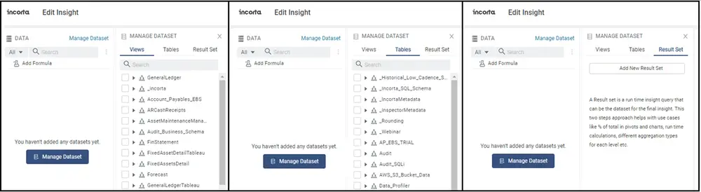
From here we need to add the datasets (Views, Tables, Result Set) that will be the data sources for the Insight.
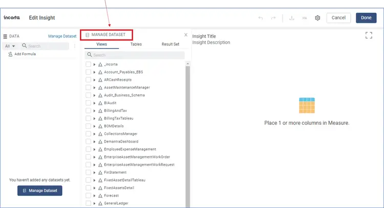
For data sources, you have three main categories; Views, Tables, and Result Set.
Views are business-oriented views that are created within the Business Schema section of Incorta. Views organize the data of the underlying tables and provide business-friendly table views and column name. Views can also contain formulas that provide common calculations that can be used across your entire organization. Additionally, views are created specifically for achieving required reports or as platforms for analysis. Views can combine data from different data bases which should make creating useful Insights quicker and easier.
Tables represent the tables from your core databases such as Oracle, DB2, NetSuite, or any other data source you have loaded to Incorta. These are the tables that appear in the Physical Schemas within Incorta. Often these tables will be represented exactly how they exist in your source database. These tables may have additional joins to other tables from other data sources. Some joins may utilize formulas defined in the schema. If you do have tables loaded from various databases into Incorta, they will appear here under Tables.
Incorta defines a Result Set this way; “A Result set is a run time Insight query that can be the dataset for the final Insight. This two-step approach helps with use cases like % of total within pivots and charts, run time calculations, different aggregation types for each level, etc.” In other words, a Result Set is an Insight within an Insight that can provide pre-summarized or pre-calculated data, which can be used and operated on within the main Insight.
Click on Views, Tables or Result Set to begin selecting data for your Insight. You may choose a combination of Views, Tables or Result Set depending on the requirements of your Insight.
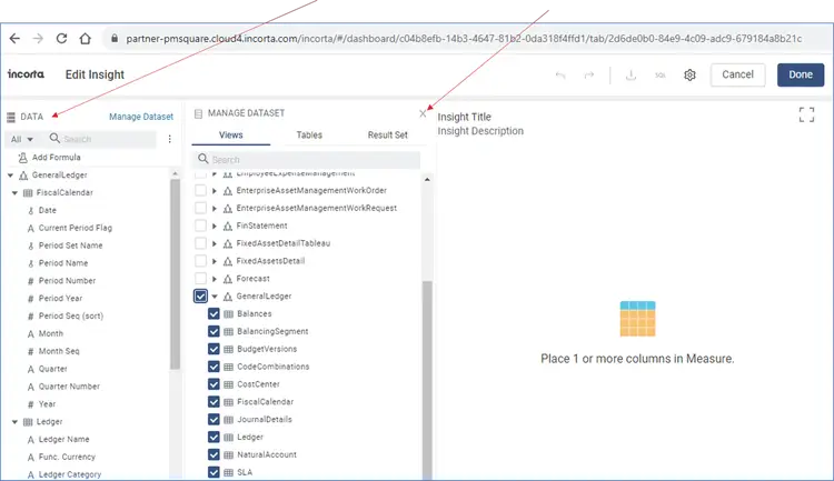
In the picture below, we have chosen to use data from Views. You can check individual tables, or you can pick an entire view to get all the tables within that view.
Once chosen, the view and tables will appear in the Data panel. Close the Manage Dataset panel.
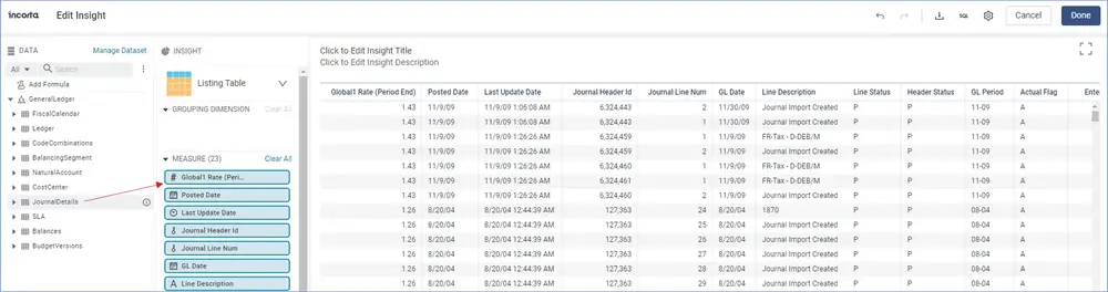
To make data easier to find, click on the three-dot icon and choose “Collapse to Table Level”. You can then expand the tables as you need. You can also use the Search function to find a column.

With the Data panel populated, you can move data to the trays. In the example below, we selected the JournalDetails table and moved the entire contents of the table to the Measure tray.
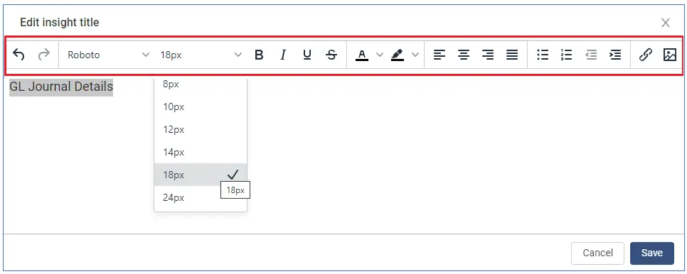
Let’s name the Insight. Click on the “Click to Edit insight Title” message and the Edit insight title window will open.
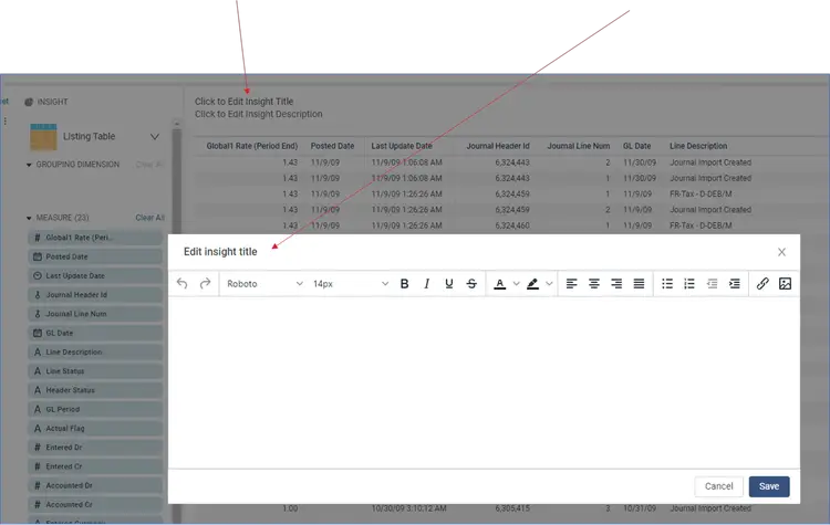
Type the name of the Insight and highlight the name to change the font size, the position, and other font parameters as needed. Click Save to save the title change.
You can also set font parameters before typing the name of the Insight. You can set the font to bold, italicize, or underline. You can also align the text, include attachments or images. If you have already entered your text and want to make a change, just highlight the text, and make your changes.
Let’s pause to finish and save the Insight as it is. Click Done to finish the Insight.
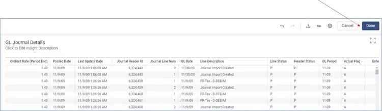
Upon clicking Done, click Save to save the Insight.
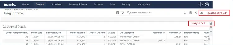
Below is the saved Insight. To edit this Insight, click on the Pen icon here. Hover your cursor on the Insight and the Edit Pen will appear.
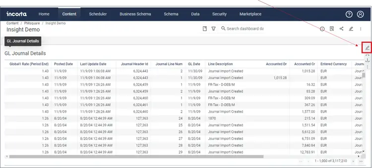
Note that there are two edit pens on the screen, the top one is to edit the Dashboard and the other one is the Insight edit pen.
Congratulations, you have created an Incorta Insight using the Listing Table visualization.
There is much more you can do with Incorta Dashboards and Insights. We will be posting more advanced information so you can take full advantage of the features Incorta offers for reporting and analysis.
Next Steps
We hope you found this article to be insightful and informative. If you have any questions about Listing Tables in Incorta, or would like PMsquare to provide guidance and support for your analytics solution, contact us today. Be sure to subscribe to our newsletter for more PMsquare updates, articles, and insights delivered directly to your inbox.
Published Date: