Chris Chapman, November 8, 2019
Get the Best Solution for
Your Business Today!
What’s New in 11.1.4
With the release of Cognos Analytics 11.1.4, we wanted to take a look at some of the more interesting features we thought were noteworthy in the release. There’s a lot in this release and we’d recommend browsing the official release notes here. So let’s get into it.
Updated Crosstab
It’s the little things in life that make all the difference. The previous version of the crosstab object was functional and did the trick. But it wasn’t always the easiest to use especially when it came to Dashboards. By default, it would consume a large amount of real estate on the dashboard which made heavy formatting and tweaking required. The default styling didn’t help matters as it looked more comfortable on a report in 2005 than 2019. Fortunately, the redesigned crosstab in 11.1.4 addresses many of these issues. It’s a simpler, more modern design that fits the available dashboard real estate much easier. A picture is worth a thousand words. However, below are screenshots comparing the old and new crosstab versions.


Automatic Forecasting
One of the many promises of analytics is that by viewing historical data, we can make predictions about the future. The caveat being that you know how to make a forecast model. This leaves many end users out in the cold when it comes to running a true forecast. They may do rudimentary +5% on year-over-year figures. Or, they may run to finance and bug them for a forecasting spreadsheet to use that will quickly be out-of-date for the next planning cycle.
In 11.1.4, IBM has baked in an automatic forecasting option within visualization. Visualizations with time series can take advantage of this new functionality. How does it run its forecast? According to IBM, “It leverages a popular class of exponential smoothing models to discover and model trend, seasonality and time dependence in the observed data. This makes it applicable to a broad range of time series encountered in business and industry.”
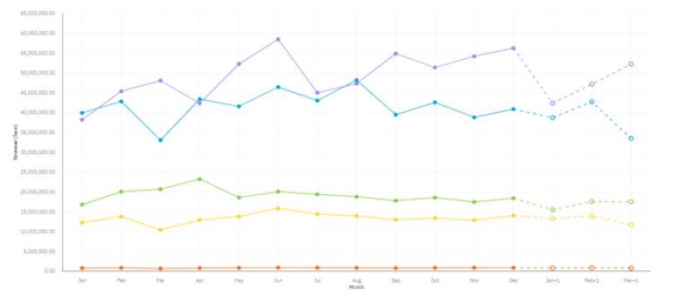
That sounds great, you say, but what does it actually look like? Below is an example of the new forecasting feature.

This line chart has had forecasting enabled. It is projecting out revenue for the next three periods. It is also is not just merely giving a single forecasted value. By hovering over each projection, we can see an upper and lower confidence bound. The chart also highlights this difference so users can graphically see the size of this delta. An example of this is shown below.

This provides the user with proper context as to how confident they should be in the forecast that was generated. This is a very cool, very powerful feature that can immediately let users gain deeper insights with no intervention from IT or finance.
Unrelated to forecasting, there is another enhancement in the above screenshot. Some of you may have noticed the revised chart legend. Legends have been improved in this version as well. You can see that they are now more compact than before. The default positioning has also been changed to the top of the visualization.
Updated KPI Widget
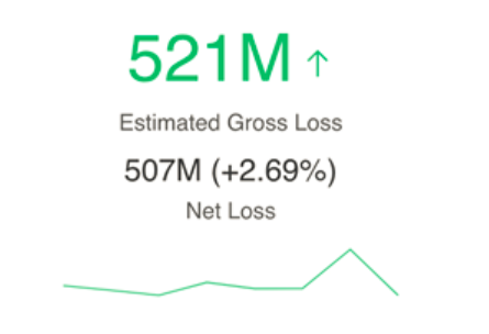
Getting back to the little things, a common request I often get from end users is to include trend formatting within KPI values. It’s a simple request that can often have complicated development answers. Fortunately, the new improved KPI visualization in Dashboard now has many of these formatting needs baked in directly. In addition to formatting, you can also include trendlines for added context!

Context-based Dashboard Generation
IBM continues to expand the AI capabilities with each release of Cognos. Within this release, this includes the ability to create a full-blown dashboard from a single chart. Sounds like magic, right? It feels a bit like magic to use. Sadly, for my Hogwarts fans, it is not magic. This is the built-in assistant being given the capability to look at a recently generated chart and derive an entire dashboard from the underlying tabular data. Let’s take a look at an example.
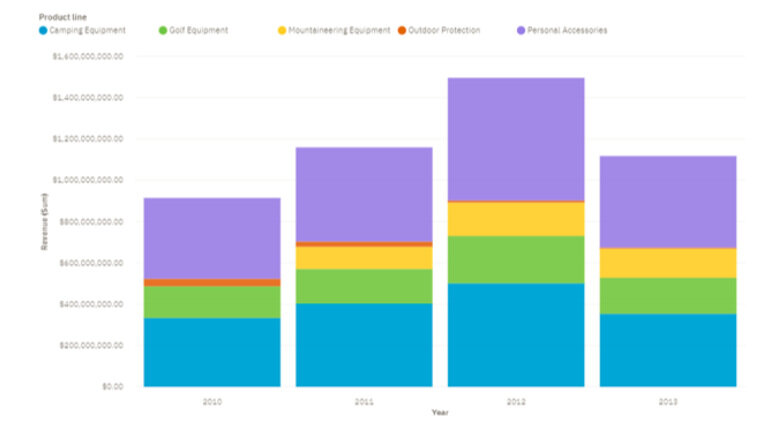
Below, we have four screenshots. The first is a simple stacked column chart I made in Dashboard. This is our starting point for the assistant. The subsequent three screenshots are of the dashboard that the assistant generated based on that original stacked column chart. That’s right, it didn’t just create a single page dashboard. It generated a multi-tab dashboard that covered multiple context views. Very cool!


Does this mean you don’t need any developers to create content? Not exactly. The robot revolution is still a few years away. If none of the generated tabs answer the user’s specific questions, you’ll end up with a pretty dashboard that no one uses. Digging a little deeper into each tab, we can find issues with a handful of the visualizations. For example, on the Product Cost tab, the bottom right line chart is so overloaded with categories that it makes deriving any meaningful insights nearly impossible.
The value I see here is being able to facilitate quicker self-service dashboard creation. Users will be able to take the generated dashboard and tailor it to their own needs. They may tweak one visualization to include territory summaries, eliminate a geo map and add a crosstab, or change that overloaded line chart into a more readable heatmap. Now they have dashboard that is customized to their preferences. I hear often from end users that want to do more self-service that they don’t know where to start. Context-based dashboard generation can help bridge that gap and get less technically savvy users going more quickly.
Customized Alerts
Keeping users informed about updates or issues within your environment can be challenging. Emails that hit users’ inboxes just add to the white noise that is email. Slack is an option if your organization has it. But you still have to rely on the users paying attention to that particular thread. In short: this can be a frustrating problem. Fortunately, IBM has finally provided a long-desired feature that once was only available via third party tools. Administrators can now create customized messages within the new “alerts banner” (shown below). This will be displayed on the user’s welcome page which means they will be greeted with relevant messages upon logging into Cognos. This can be a very useful tool in your toolbox to communicate with users and ensure they are up-to-speed on the current state of the environment.

Additional Enhancements in 11.1.4
- Null suppression in crosstabs or tables
- Waterfall visualization available in Dashboard
- Custom visualizations
- Automatic Sorting by Time
- Jupyter notebook data in a report
- IBM Plex font
- Navigation menu customization
Click here for more information from the IBM Knowledge Center
Conclusion
The new version brings many anticipated capabilities to the forefront of business analytics. With this version, IBM further cements their claim of being the lone vendor to say of mode 1 (centralized) and mode 2 (self-service) analytics, ‘you can have your cake and eat it too.’ If you want to see Cognos 11.1.4 in action, check out our livestream demo on our Youtube channel.
Next Steps
We hope you found this article informative. Be sure to subscribe to our newsletter for data and analytics news, updates, and insights delivered directly to your inbox.
If you have any questions or would like PMsquare to provide guidance and support for your analytics solution, contact us today.


