
Share


Werner Coetsee, April 10, 2023
Get the Best Solution for
Your Business Today!
Data visualization has become an increasingly important tool in today’s data-driven world. By converting complex data sets into visual representations, we can quickly identify patterns, trends, and insights that would be otherwise difficult or impossible to detect.
IBM Planning Analytics Workspace, or PAW, is designed to offer a user-friendly and intuitive interface that makes it easy for users to create data visualizations. This makes the process of creating data visualizations with a tool like PAW straightforward. Additionally, the tool connects directly to the source data in Planning Analytics cubes, allowing users to create visualizations that are based on real-time data.
Table of Contents
In this article, we will explore how you can use different visualization types, the layout of a workbook, and different property settings in PAW to create an appealing design that truly stands out from the rest, capturing the attention of the audience and effectively conveying important insights from the data.
Type of Visualization
IBM Planning Analytics offers a range of 28 distinct visualizations, which can make selecting the most appropriate one for data visualization a challenging task.
To determine the most effective visualization, the type of data being examined should be considered. For instance, if analyzing the sales performance of a company over a year, a line or area chart would be the most suitable as it displays changes over time, making it easy to see how sales have varied throughout the year. Conversely, a pie chart would not effectively convey the magnitude of changes over time and provide insufficient insights into the company’s sales performance.
Various guidelines are available to help choose the appropriate visualization for a given data set. For example, Andrew V. Abela’s “Suggestions-A Thought-Starter” offers a useful set of principles for selecting the most effective visualization.

However, these guidelines should not be seen as strict rules that limit creativity. By combining your own intuition and creativity with a deep understanding of the data, you can create visualizations that not only communicate insights, but also engage the audience and tell a compelling story. Therefore, don’t be afraid to experiment with different visualization types and techniques to create a visualization that is not only informative, but also engaging and thought-provoking.
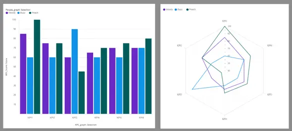
For example, if we look at Image 1, suppose we have a model that scores three individuals on six different KPIs (Key Performance Indicators). The original visualization is a classic bar chart that shows the performance of each individual on each KPI. However, by simply changing the visualization to a Radar graph, we create a new perspective of the data. With the Radar graph, we can now look at the overall performance of each individual across all KPIs, requiring less cognitive effort than the classic bar chart. This change in visualization not only simplifies the analysis process but also provides a more holistic view of the data that can reveal new insights.
Business requirements also play a crucial role in determining the type of visualization used. In some cases, clients may have a specific template or visualization in mind that they want to see, which can limit the creative freedom of the designer. In such situations, it is important to communicate with the client to understand where the requirement comes from. Are they requesting the visualization in a specific way because this is the way the data has always been presented or can this be used as an opportunity to showcase the data in a new way the client hasn’t considered?
Layout
To effectively convey insights from data, the layout of a visualization is just as important as the type of visualization chosen. In PAW there are a variety of options available to customize the layout of visualizations, including choosing the size and symmetry of the visual elements.
Template
IBM Planning Analytics Workspace offers a variety of templates that feature predefined designs and grid lines, which make arranging and aligning visualizations a breeze. However, relying solely on default templates can lead to a lack of originality and may make your workbook seem unremarkable. To make your workbook stand out, it’s important to utilize the freeform template functionality provided and create innovative and unique layouts. Doing so can give the perception of exclusivity and innovation, instantly elevating your workbook.
Size
When sizing visualizations in a workbook, it is recommended to consider the importance of the insight that will be drawn from them. The most crucial aspect of sizing is the 0-size visualization, which means that if a visualization is not significant to the analysis, it should not be included in the workbook. This approach helps to preserve valuable space in the workbook and ensures that the analysis is focused on relevant information.
Additionally, white space is a valuable asset in creating an effective layout. Proper use of white space can help to reduce the level of visual noise in the workbook and create a clear, logical flow of information.
Symmetry
Incorporating symmetry, or at least some degree of symmetry, to a workbook can enhance its visual appeal and facilitate a logical order in which the workbook is analyzed. It is important to consider the order in which the information will be presented and how the viewer’s eye will naturally move across the visualization.
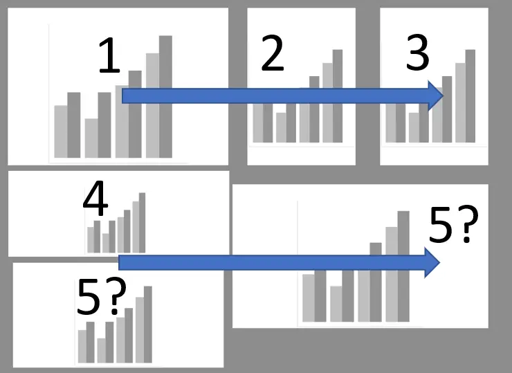
Consider Image 2 below. You can clearly follow steps one to four, but as soon as you need to go to the fifth visualization the brain gets confused and the outcomes of the story your visualization tells might differ from person to person. This is because the human brain naturally flows from left to right and top to bottom, which is rooted in the way we learn to read.
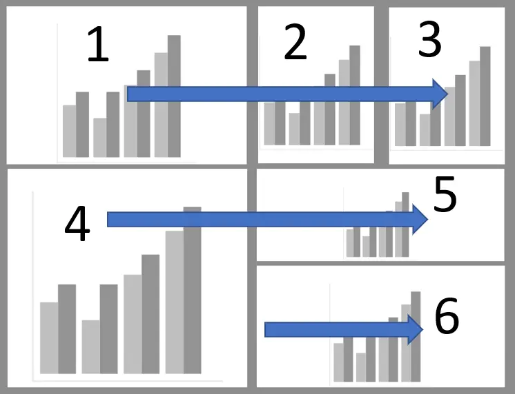
In Image 3, the exact same story is told in a more structured way using a grid / table layout. This not only makes the visualization easier to understand, but it also increases its effectiveness by ensuring that the intended message is communicated clearly and consistently to all viewers.
Properties
PAW provides a variety of visualization properties that can be used to enhance the appearance and functionality of visualizations. These properties can be used to further customize a visualization and to make it unique and interactive.
Branding Colors
When creating a workbook, the color palette functionality can be utilized to incorporate an organization’s color scheme and branding into the visualization. By doing so, it automatically creates a familiar environment, and employees are more accepting of the workbook. This is an effective way of building brand recognition and familiarity.
Brightness & Contrast
In today’s era, having bright, colorful, and flashy dashboards is no longer the trend. Clients and developers have noticed that such bright colors are distracting in a negative way. Therefore, in a workbook, the aim is to attract, not distract. This means that the insights of the data should be the main attraction, while any distractions should be minimized. This can be achieved by using less bold colors throughout the workbook and utilizing bold colors when necessary to attract. This approach ensures that the workbook is easy on the eyes and focuses on the data without being visually overwhelming.
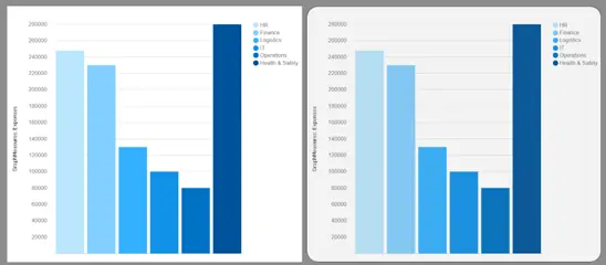
Consider the two column graphs below in Image 4 both representing the same data. The graph on the left represents a distracting visualization, while the graph on the right focusses the attention on what is important by using some of the powerful features available in IBM Planning Analytics.
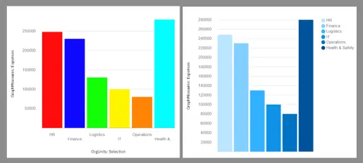
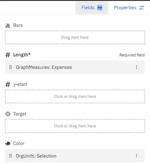
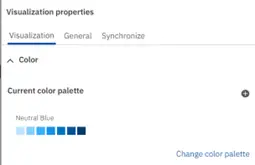
This was accomplished by making use of the Color field in the Fields tab to distinguish between the different organizational units, as seen in Image 5, and creating the desired color palette in the properties tab, as seen in Image 6.
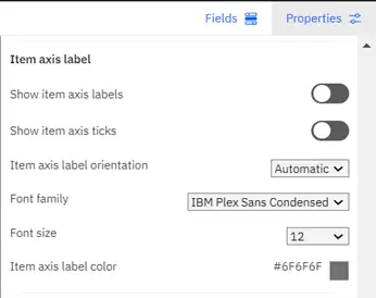
The utilization of “Show item axis labels,” shown in Image 7, provides an option within the item axis label panel to facilitate the elimination of the x-axis labeling and is replaced with labels positioned to the right of the graph. This, in turn, augments the available space within the graph, depicted in Image 4, enabling the addition of values on the y-axis, thereby providing more detailed and precise analysis.
Softness
Softness is still an unfamiliar term in the data visualization world, yet it can add so much to a workbook. Softness is achieved by making your workbook look less hard, simple as that. This can be achieved in many ways.
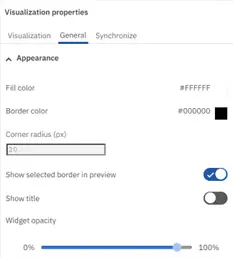
Consider the two column graphs below (Image 8). Both present the exact same data, however, the graph to the right has additional property configurations to make it look and feel like a widget. By creating a widget effect the visualization does not look as though it is glued to the screen.
The widget effect is achieved by changing three property settings, shown in Image 9.
- Add a border to create a space between the canvas and the visualization.
- Change the corner radius to between 10 and 30 pixels.
- Use the widget opacity slider to slightly dim the visualization.
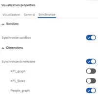
Synchronization
Synchronization is used to filter dimension members across multiple visualizations, as seen in Image 10. This enables a centralized control unit for filtering and makes the visualization interactive.
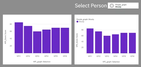
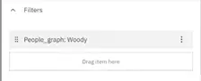
The graph on the left is filtered using the built in Filters mechanism in the Fields tab, shown in Image 11. The graph on the right uses the Synchronization feature on the desired dimensions, depicted in Image 12, and has a selector at the top right of the page to enable it.
Conclusion
Utilizing your understanding of the data will help generate distinctive concepts for new visualizations. Make the most of these ideas by utilizing the full capabilities of IBM Planning Analytics and its strong visualization tools. As PAW continues to evolve, thus is the best practice for visualizations and reporting to evolve with it.
We hope you found this article informative. If you have any questions or would like PMsquare to provide guidance and support for your analytics solution, contact us today.
Be sure to subscribe to our newsletter for data and analytics news, updates, and insights delivered directly to your inbox.