

Share


Dan Swan, December 11, 2023
Get the Best Solution for
Your Business Today!
In Planning Analytics Workspace release 2.0.81, IBM added a new Single-cell visualization type with several unique capabilities. The Single-cell visualization is a single cell Exploration that has been added as a Visualization. You can still create a single-cell view using the Exploration visualization, but it is much easier to use the Single-cell visualization type. The Single-cell visualization is designed to display a single value from a cube without row or column headers and without the context filters. Using the Fields Property, you can configure and filter your cube data to arrive at a single value for the visualization. So, when you have the need, you can quickly add a simplified, single-value display to your report or dashboard.
Table of Contents
How to Add a Single-Cell Visualization
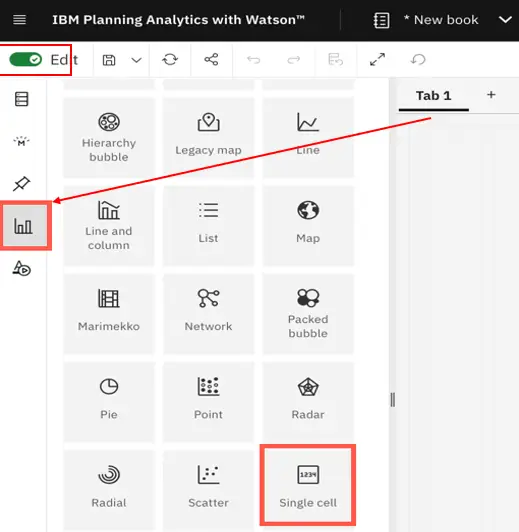
- In Edit mode, click on Visualizations and then select Single-cell and the Single-cell template will appear in the canvas. Then drag a cube or view onto the template. The Single-cell template will display the first cell of the cube and the Fields property will automatically open.
- Another way to add a Single-cell is to right-click a view (or click on the three-dot icon on the right), then select Add view. Once the view is on the canvas, convert the view to a Single-cell visualization. The Fields property will open showing the current configuration of rows, columns, and filters. If you select a specific cell before you convert an Exploration, the selected cell will become a single cell in your visualization. Otherwise, the visualization will display the first cell in the view. In the Exploration below, when the visualization is converted to a single cell, the highlighted cell will be selected by default if a specific
Note: Any existing cell widgets created in books before Planning Analytics Workspace 2.0.81, will convert to a Single-cell visualization with Field dimensions and visualization properties.
When you create a Single-cell visualization, the Fields property is populated and you have the option to change various properties as you would other visualizations. Below, we review the Single-cell visualization properties and then walk through a use case with a Single-cell visualization paired with an Exploration in the same report.
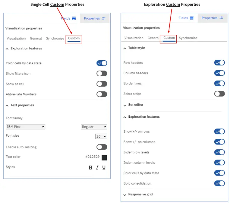
Within Visualization properties, Conditional Formatting and Chart properties are the same for Single-cell and Exploration visualizations.
The Single-cell visualization does not have Data Cell, Row Header, and Column Header in Visualization properties, but Data Cell properties appear under Text properties within the Custom Property for the Single-cell visualization (see below).
Row Header and Column Header properties are not needed for the Single-cell visualization since the Single-cell visualization was designed to serve a different purpose than an Exploration.
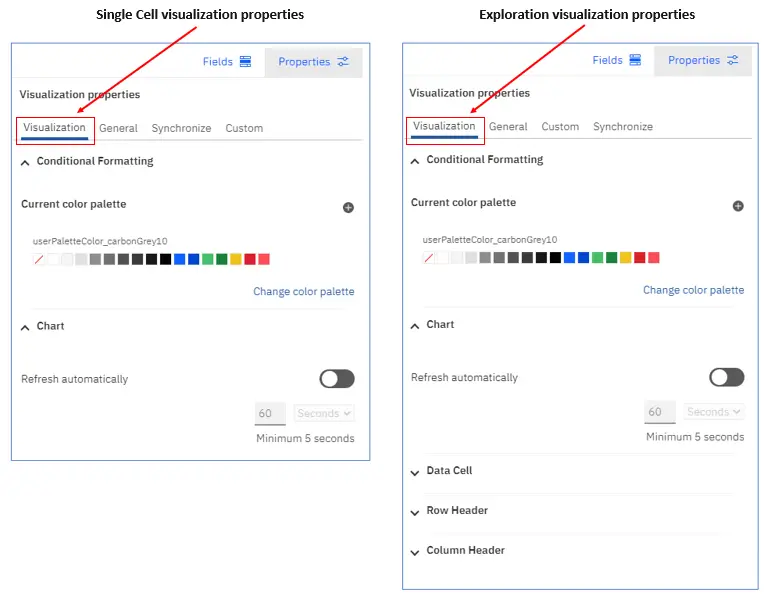
When comparing Custom properties for Single-cell and Exploration visualizations, note that Single cell visualizations do not have the Table style, Set editor, or the Responsive grid property.
Within the Exploration features, Single cell visualizations have some unique options including the Show filters icon, Show as cell, and Abbreviate numbers.
- Color cells by data state – if selected, read-only cell backgrounds are colored gray, and calculated cell backgrounds are colored green. Disable this option to remove color.
- Show filters icon – with this feature turned on, the blue filter icon will appear in the upper left-hand corner of the visualization as shown below. Click on the filter icon to view how the data is filtered. This function is view only. To change the filters, go to the Fields property.
- Show as cell – with this feature on, a thin border will appear around the cell (below). Note that this cell border is not the border that can be changed in the General properties tab. The General properties border is the visualization border.
- Abbreviate Numbers– with this feature enabled, large numbers are abbreviated to use “K” for thousands (30,000 becomes 30K) and “M” for millions (12,300,000 becomes 12.3M).
Within Text Properties, the Enable auto-resizing property allows the font size of the data to automatically change as the size of the visualization changes. The Font size property is ignored when auto-resizing is enabled.
Building a Report with a Single-Cell Visualization
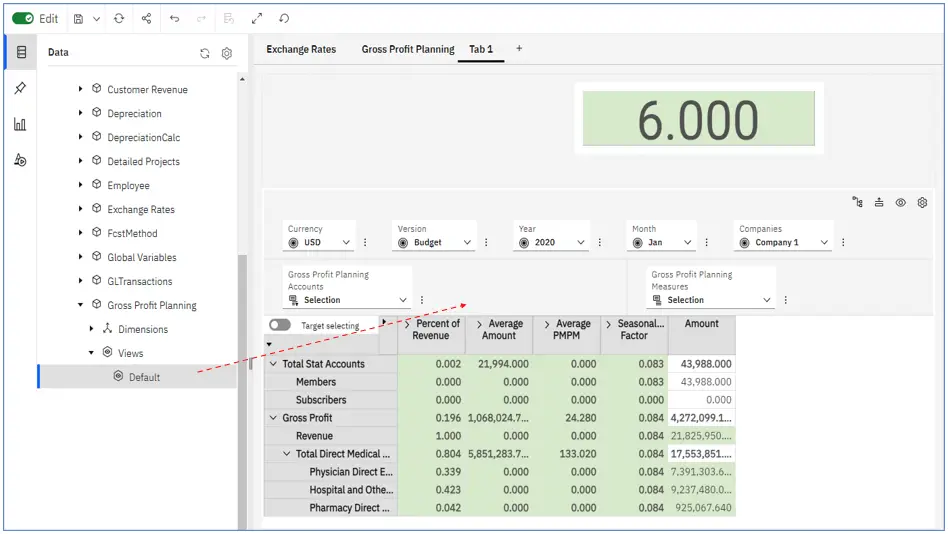
In the example below, we are using the Smartco sample database from IBM.
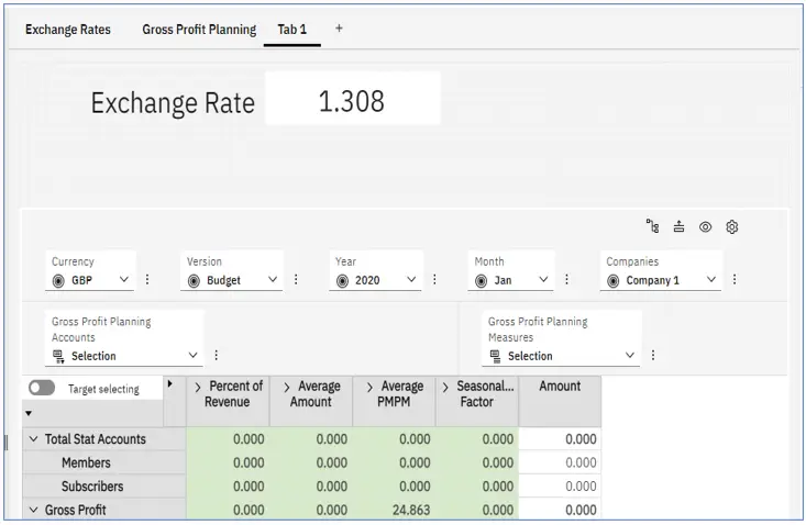
Using a Single-cell visualization from the Exchange Rate cube and a normal Exploration from the Gross Profit Planning cube, we can recreate the tab below in Tab 1 within Workspace.
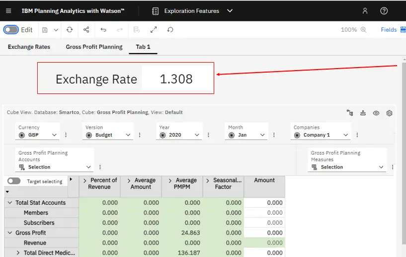
In our new tab, we want to show the appropriate exchange rate for any change to the Currency, Version, Year, or Month that we make within the Gross Profit Planning view.
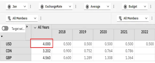
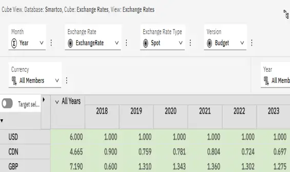
The Exchange Rate cube (shown directly below) contains currency rates by Version, Year, and Month. For our Single cell visualization, we want to use the Exchange Rate from the Exchange Rate dimension and the Spot rate for the Exchange Rate Type.
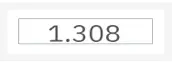
We will use the view below to create the Single-cell visualization you see above.
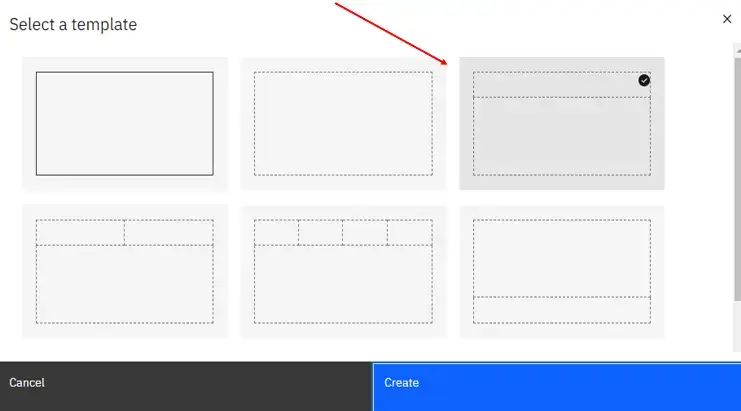
To create the new tab we’ll add a new tab to the book. Select the single, top banner template.
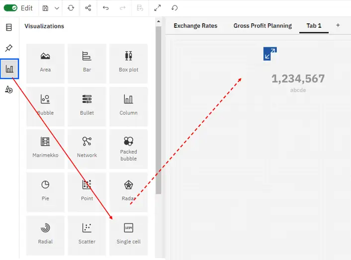
Go to Visualizations, click and drag Single cell to the top (banner) section of the template, or you can just click Single-cell and the template will appear in the top banner.
Go to the Data tree, click and drag the view to the Single-cell template. We have chosen the Exchange Rates view from the Exchange Rates cube.
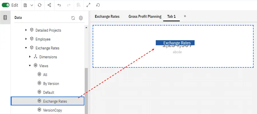
With the Exchange Rates view in the Single-cell visualization, the Fields section will automatically fill in based on the view we added. The cell in our Single cell visualization will be the first cell in the cube.
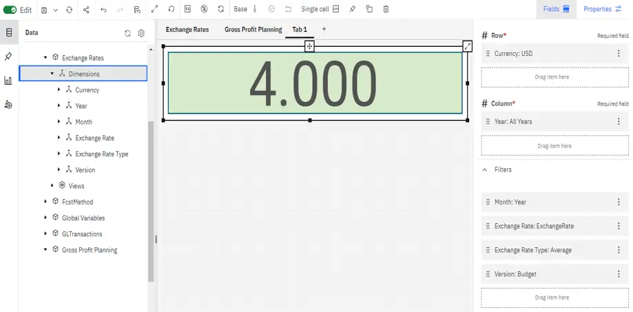
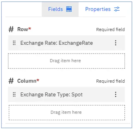
The Exchange Rate dimension should be on the Rows and the Exchange Rate Type dimension should be on the columns because we want them to remain static and they are not shared with the Gross Profit Planning cube.
You can click & drag the Exchange Rate dimension on top of the Currency dimension and the dimensions will swap places.
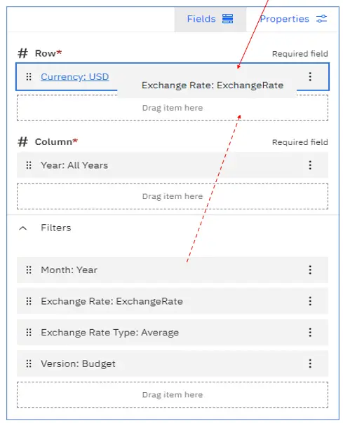
For the Column, drag the Exchange Rate Type dimension on top of the Years dimension.
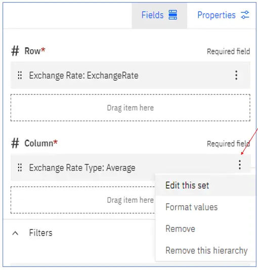
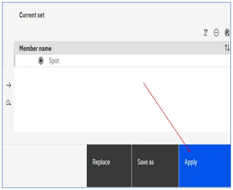
We need to change the dimension member for the Exchange Rate Type. Click on the three-dot icon and select Edit this set.
In the Set Editor, within the Current set, we want Spot to be the only member in the set.
Click on the check mark to Keep Spot.
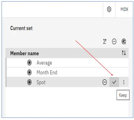
With Spot as the only member in the set, click Apply.
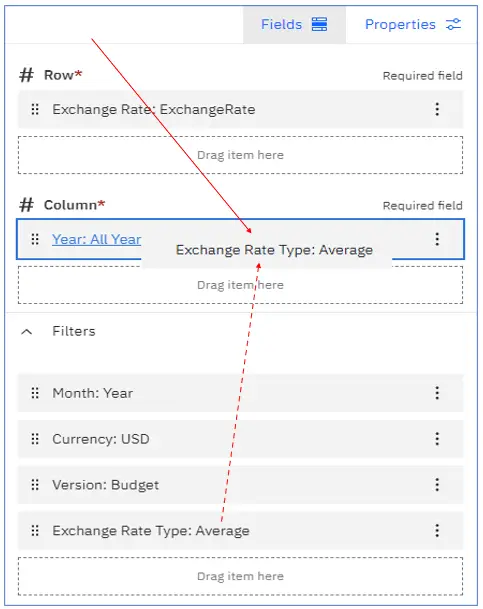
Now the Row and Column each contain a single member.
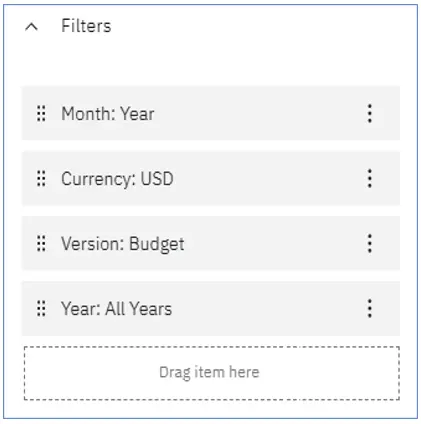
The Filters will remain as they are. Later, we will synchronize the filter dimensions with our report.
Next, click and drag the Default view of the Gross Profit Planning cube to the bottom section of the template.
We want the Exchange Rate in the Single-cell visualization to change each time we change either the Currency, Version, Year, or Month within the Gross Profit Planning cube.
To synchronize the two views first, select the Exchange Rate view and click on Properties and select Synchronize.
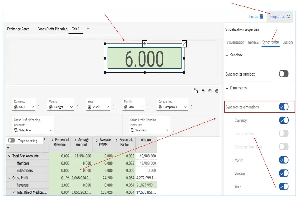
Set Synchronize dimensions to yes. Then set Currency, Month, Version, and Year to synchronize. Note that the Exchange Rate and Exchange Rate Type dimensions are not available to be synchronized. That is because they are in the Row and Column of our Single cell visualization. Only dimensions within the filter of the Single-cell visualization can be synchronized.
Select the Gross Profit Planning view, click Properties and enable Synchronize dimensions.
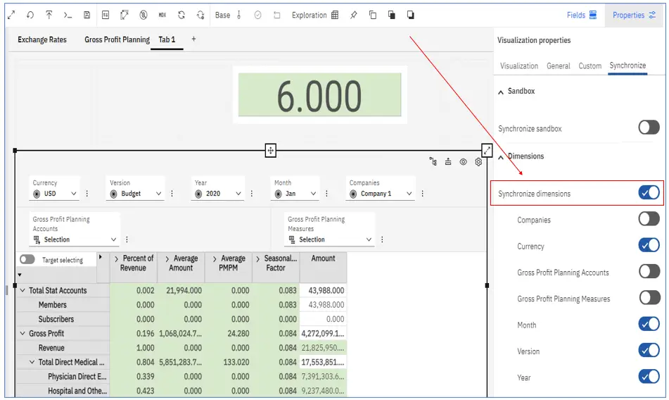
Set Currency, Month, Version, and Year to synchronize. Synchronize only the dimensions that match with the Exchange Rate cube.
With the two cubes synchronized, we can improve the usability and style of the report.
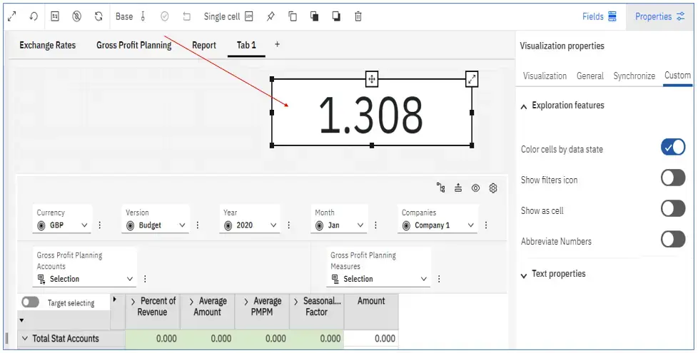
Click on the Exchange Rate cube and select Properties, then Custom. Turn off the “Show as cell” feature. This will remove any background color or border around the cell.
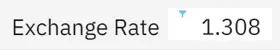
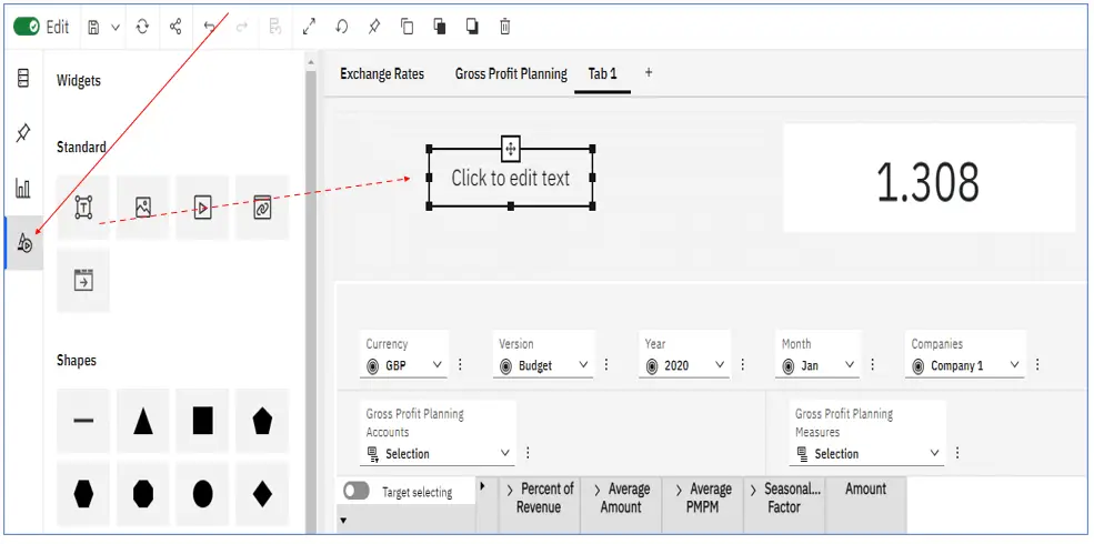
Next, add a text box to create a label for the exchange rate cell.
Click on the Widgets icon, then click and drag the Text box to the top section of the template. Edit the text by adding “Exchange Rate”.
Size the Text box font to closely match the font size of the rate cell.
To further improve the look of your report, you can align the text in the single-cell visualization. Right-click on the cell, go to Cells Alignment, then make your alignment selection. You do not need to be in Edit mode to make this change.
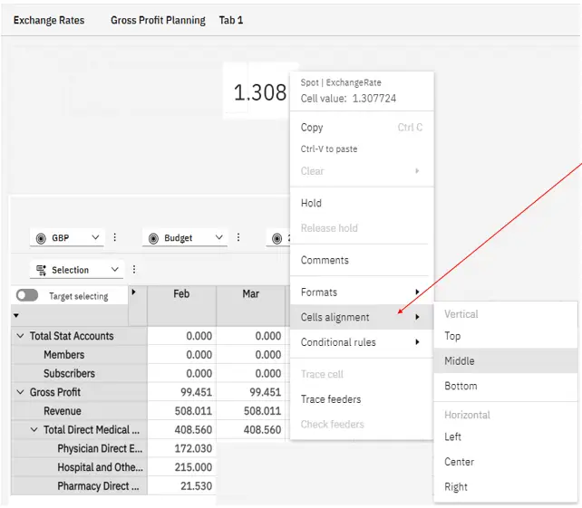
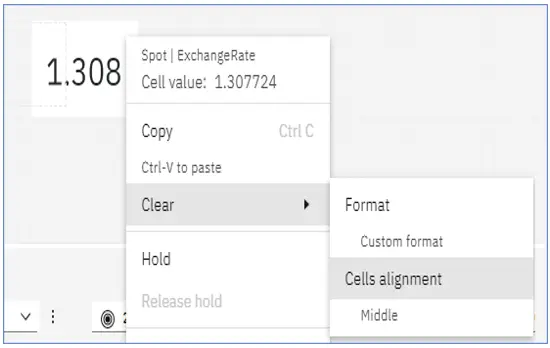
To undo the cell alignment, right-click on the cell, go to Clear, and select Cells alignment. Note that your cell alignment selection appears below Cells alignment.
Now a user can select a different currency, or a different year or month within the report, and the appropriate exchange rate will appear in the new Single cell visualization.
Conclusion
Use a Single-cell visualization whenever you want to display a single value in a streamlined, clean style. You can use it to sync with an Exploration or with one of the other chart visualizations. It’s a quick, easy way to highlight important data within your reports. Let us know in the comments below how you have been using the Single-cell visualization.
Next Steps
We hope you found this article to be informative and helpful. If you have any questions or would like PMsquare to provide guidance and support for your analytics solution, contact us today. Be sure to subscribe to our newsletter for more PMsquare articles, updates, and insights delivered directly to your inbox.
Published Date: